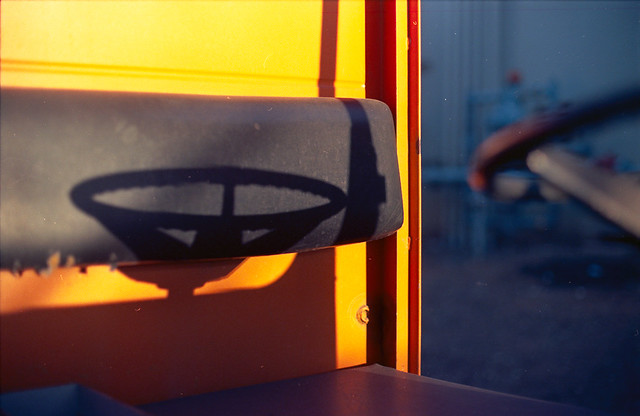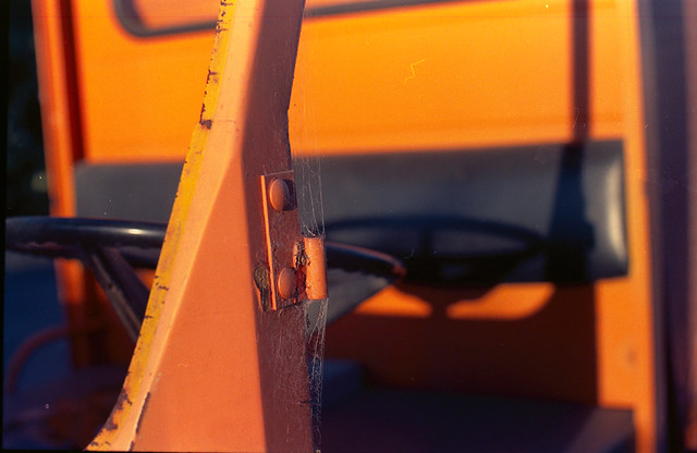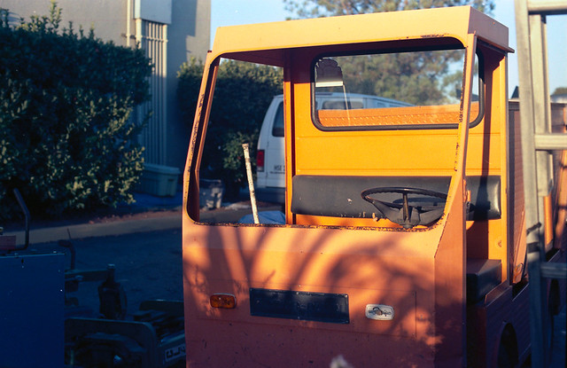

 The first thing I ever learned about color theory was that orange and blue are "complimentary" colors. That is if you make a circle with a rainbow going around it, orange and blue will be opposite each other. That is an extreme oversimplification, because it matters what color space or color model you are using. In this case, it is standard RGB. For a long time, I thought that meant that the colors 'clashed' and should not be used together in any pleasing artistic composition. This is obviously a foolishly amature conclusion to anyone who has ever enjoyed a sunset. The truth is that orange and blue create great contrast and can really enhance your subject's visibility and thereby improve your composition. Here are a few photos I took recently with my '67 Nikkormat FTn on a roll of Kodak Ektar 100. I love this camera. It is the camera I learned on 30 years ago and I still learn from it even to this day.
The subject is an old beat up maintenance vehicle I came across at my son's school. The sun was setting just right so that the orange vehicle was lit up but the background was in shadow, making it look blue on film. I think these came out kind of nice, especially when viewed together as a triptych.
No comments:
Post a Comment