Thursday, July 31, 2014

Underexposed Kodalith

I got a couple of rolls of expired (2004?) Kodalith in 35mm from Hungry Mike over on Filmwasters. I threw one into my Nikon N2020 and set the iso to 100. I couldn't remember what iso was recommended to shoot this film and I was too lazy to go look it up. I figured 100 would be in the ballpark and the film probably had enough latitude to compensate if I was under-exposing. Now the other thing I forgot was that Kodalith is a VERY contrasty film to begin with. So if you under-expose/over-develop (push process) you are going to get even MORE contrast. I didn't consider any of these things when I was shooting this film and I guess that I part of my 'experimentation' process. I tend to forget details and then when I get the photos out of the tank/scanner I think to myself, "Well, that's not quite what I had in mind." But then I come back to the photos a week or two later and decide that there is some artistic merit there and even if it wasn't what I had envisioned when I pressed the shutter, I can still appreciate it. So I was doing a 2-3 stop push on this film and many of the shots were just too dark to really make out what the subject is. These two photos however, were composed with enough light/highlights that the image is clear. The increased grain and contrast work in these cases and I have come to like these images. So the lesson here is that 'experimentation' will probably yield something you like and it will definitely teach you something about your art or your process. I'm not one to really hope for "happy accidents". I would rather know what I did, so that I can do it again if I like the results, or not do it again if I don't like them.

Bamboo

Sunflower

Tuesday, July 29, 2014

Pushing Through Addendum

When I wrote the last two Pushing Through articles, I used a couple of photos from one of my favorite cameras; my 1939 Voigtländer Bessa 6x9. I love using that camera and am always wonderfully surprised when I see the results. There is a lot of fuss made about lenses these days. How many elements in how many groups, what kind of coating, rotating or fixed front element, etc. Here's what I have to say about that. Photography is art (unless you are doing scientific or some other kind of strictly documentary photography). The artist needs to use the tools that will give him or her the results that are pleasing to them. If you like tack sharp perfection of contrast and color, then you should stick with modern lenses, preferably high-end ones. I have gone that route and even got caught up in 'pixel peeping' to make sure that my images were just as sharp as they possibly could be with the equipment I had. Then I rediscovered film via the Holga. This 'opened my eyes' to a world of color and shapes and blur and haze that I sort of knew existed, but never thought much about. That little plastic meniscus lens opened doors into creative spaces in my brain that I didn't know were there. Then I started buying old cameras and old film to see where that would lead and it took me deeper into those places. These days, I don't mind taking a shot or two with my DSLR or even on my phone (if required), but when I want to really be creative, I get out an old camera. Maybe it has a really nice lens (for its day), maybe it doesn't. In the case of these photos taken with my Bessa, the lens is a decent 'triplet' type without any coatings. The focus is done by estimation of the distance to the subject and exposure is measured either with a hand-held meter or by 'sunny sixteen'. These are not the sharpest, most contrasty, color accurate photos I could make, but I love the way this camera 'interprets' the light. It fits well with my artistic vision.

These were taken on Kodak Ektar 100 film. I don't shoot this film very often, but it does a very nice job rendering color in a vivid but accurate way. Compare these to the shots done with the same camera on expired Tri-X. Leave a comment if you have an opinion about which are better. Lake Morena Oak

Lake Morena Ruins

Thursday, July 24, 2014

Pacific Southwest Railway Museum

A couple of weekends ago, my family packed up for an outing. We live in San Diego which is pretty hot in the summer, but with two boys in school, we don't have a lot of options for getting out of town. The youngest wanted to go 'camping', but here in So. Cal. the camp sites have to be reserved and they get filled up about 6 months in advance. So there we were without a reservation, wondering where we could go. So with a little searching, we found a small lake down near the border and out east about an hour away. It was going to be hot there too, but at least we could get away from work and 'routine'. One of the up-sides of this location was that it was near Campo, CA and in Campo is the Pacific Southwest Railway Museum. I figured that there would be ample photo opportunities there, so I brought my large format (4x5) Speed Graphic and 6 sheets of Kodak CSG x-ray film. Taking only a limited number of sheets forces me to slow down and consider my shots more carefully. So here are the three best shots from that day.


I have to say that I was pleasantly surprised at the museum. I am not an 'old train guy'. I am an 'old camera guy', but the two are oddly akin. They are machines of a bygone era that hold a fascination for those who still use them. They are more mechanical than electronic, with gears and springs and levers doing the precision work of taking photos or moving people and cargo. The Pacific Southwest Railway is definitely worth a visit. The 12 mile train ride through the rugged California back country is wonderful for all ages. The display house has some great engines and restored cars that you can get right into and feel like you have stepped back in time.

I hope you take a trip down to Campo and see the Pacific Southwest Railway Museum. It is worth the drive and if you bring along your camera, you will be rewarded with lots of great photos.

Monday, July 21, 2014

Pushing Through XV - The Final Entry

I have really enjoyed putting this series together. Looking for examples when I was out walking around my suburban environment turned out to be easy. Finding somewhat unique examples at a time of day that rendered them aesthetically pleasing was a bit more of a challenge. I always had in mind the photo I wanted to end the series with and so when I saw it while hiking around Lake Morena, I took a couple of shots with my '39 Voigtländer Bessa on some expired Tri-X I had loaded. It was mid-day, so the light is less than desirable, but I took the photos anyway and now I think it is time to bring this to an end and move on to another photo project. I hope you have enjoyed the series and look forward to any comments you would care to contribute.

Saturday, July 19, 2014

Pushing Through XIV

This entry into the series is a little different. The theme of these photos is nature "pushing through" the obstacles set up by mankind. However in this case I found nature pushing through its own obstacle. We recently took a long weekend holiday out to the east of San Diego near Campo, CA at a place called Lake Morena. It is an old reservoir intended to store water for the city of San Diego. It was also a fishing lake that was stocked with various types of fish for sportsmen to catch. Recently, the decision was made to drain teh water down to other storage reservoirs closer to the city. This left Lake Morena at just 4% of it capacity. Really it is now a very small body of water and from our camp site, we could not see the lake, but we had a nice view of a meadow where the lake used to be. Right between our cabin and the meadow was a very big, very old California Live Oak. That is not very interesting, but what was interesting was that it was growing out of a crack in a huge outcrop of solid granite.

I can imagine a bird or squirrel dropping an acorn there in a small crack and maybe there were a few wet winters and mild summers that allowed the little sprout to get some roots down. Over the decades this tree has grown and actually pushed against the sides of the crack to expand it, sending roots deeper and growing bigger. Today it is truly beautiful and its branches spread out over the granite making a nice cool spot for animals and people to escape the summer heat.

This tree won't live forever, but it will live for a few hundred years, after which there will be a bright spot over a roomy crack in a big granite boulder... a perfect place to put an acorn for safe keeping.

Sunday, July 6, 2014

PhotoShop Cyanotype Negative Postcard

I thought I would just do a quick tutorial for those who may not be super familiar with PhotoShop. The project is intentionally simple and intended for those just starting out with the tool. Since what I am doing is so simple, the steps will be very similar in GIMP if that is what you are using. The tools I am using are common to both applications.

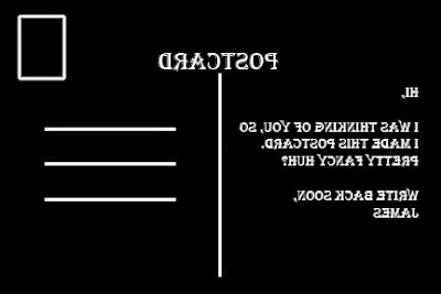
First, create a new file of the size you want your postcard to be. I chose 4x6 and filled the background with white. We are going to invert the colors later, so if you would rather work on a black background, that will save you a step at the end. I made my project 8 bit grey-scale since I am making the 'back' of the postcard (the part with the address and stuff). So now we have a white "card" to start working with. Now before you ask "Why don't you just do a google image search and use someone else's image?", I will say that a) this is fun and b) I'm guaranteed not to infringe anyone's copyright.

Next, let's make a new layer and draw some lines and boxes. In the layers dialog or in the layers menu, create a new layer and name it "Lines". In PS, you do this by right-clicking the layer and going to the 'Layer Properties' item. Select the title box and type in the name you want. Now to start drawing. Select the Pencil tool and set the size to 3px. If you don't have the rulers showing, you should turn them on by looking in the 'View --> Rulers' menu. In PS press Ctrl-0 (in GIMP Ctrl-Shift-J) so that your image will fill the workspace. I am going to start with a vertical line that separates the left "message" side from the right "address" side. I don't want to go from edge to edge, so I start 1" from the top edge and 3" from either side. Click once to make a dot there. Now move your mouse down to a quarter inch above the lower edge and still at the 3" mark horizontally. Hold down the shift key and click once again. You should now have a nice straight line. If your line is slanted, erase it and try again.

Next, let's make some lines to write your address on. Again with the pencil tool and watching the rulers I made my first dot at the 3 5/8" mark horizontally and the 1 3/4" mark vertically. The next dot (shift - click) was in the same place vertically and at the 5 3/8" mark horizontally. Great I have the first of three address lines. Now getting two more of these to be exactly the same is not too hard, but is is so much easier just to copy the one I have and paste it twice. Then I can use the move tool (four arrows pointing at NSEW directions) to position them. So use the rectangular marquee tool to draw a box around the horizontal line you just drew. Then Ctrl-C. Then Ctrl-V. It may paste it directly on top of the existing line, so just grab it with the move tool and drag it down to where you want it. I positioned mine 1/2" apart.

Great, now we need a place to put the stamp. This is sort of frivolous since it will probably be covered by the stamp itself, but we're here, right? Might as well do a good job. Choose the rectangle marquee tool again and draw a... uhhh rectangle in the upper right corner about the size of a postage stamp. Precision is not important here. This is just decorative. Box drawn? Good. Now select the 'Select --> Modify --> Border' menu and in the dialog box choose 2px for the width. Now you should have two concentric boxes selected. Click on the Bucket Fill tool and click in the little space between the boxes. That should give you a nice rectangle to put your stamp on. Just a couple more steps and we'll be done.

Now we are going to put some text on the postcard. One piece will be the word "Postcard", just so people aren't confused about what kind of mail they are getting from you. ;) Choose the text tool which usually looks like a capital 'T'. and draw a big box across the top of your card above the vertical line. Don't worry too much about the position as we are going to reposition it once we get the word typed. It might take a few tries to get the size right, but just keep trying. Fonts are very personal and so I will leave that choice up to you. I like a 'classic' look, so I use Algerian around 24pt. Then I use the move tool to grab the word and position it above the vertical line. If you choose, you can put some text in the left message section or leave it blank for hand-writing a note.

Finally, I am going to use this for contact printing cyanotypes. Obviously, you could just print this onto a sturdy card stock, print a photo or draw something on the other side and that would be awesome too. But I need a negative, so first I go to the 'Image --> Image Rotation --> Flip Canvas Horizontal' menu and flip everything backwards. This is because I am printing this face-down, so it will be right on the final print. Next I create an adjustment layer and choose 'Invert' so that I now have white lines and words on a black background. GIMP doesn't have adjustment layers, so you have to just go to the Color menu and choose Invert.

That's it! You now have a postcard back ready for your art on the other side. Like I said, this was pretty simple and you could probably get by with almost any simple drawing tool. Heck, you could probably do it in Word or Excel or PowerPoint for that matter. I personally think the drawing programs like PS and GIMP bring a lot to the table to make things easier and they are very much worth the time to learn. I hope this was useful and that you can take this simple tutorial and use it to create something wonderful!

Friday, July 4, 2014

Pushing Through XIII

Here is another in my series where I am capturing plants that are defying man's attempts to control them. You can see the rest of the series HERE.

This shot was taken in the waning light of late twilight. You can see the sodium lamps in the distance. The sky looks brighter than it was because I made a 5sec exposure on Portra 160 film. It was even too dark to get the focus right. You can see that it is about a foot or so in front of the particular bushy plant that I was 'aiming' at. This plant is growing up between the ties of an abandoned railroad track. The trees overhead are dropping debris on the rails as well. If this keeps up for another 10 or 20 years, the tracks will be lost to the mini urban jungle that is growing up around them.