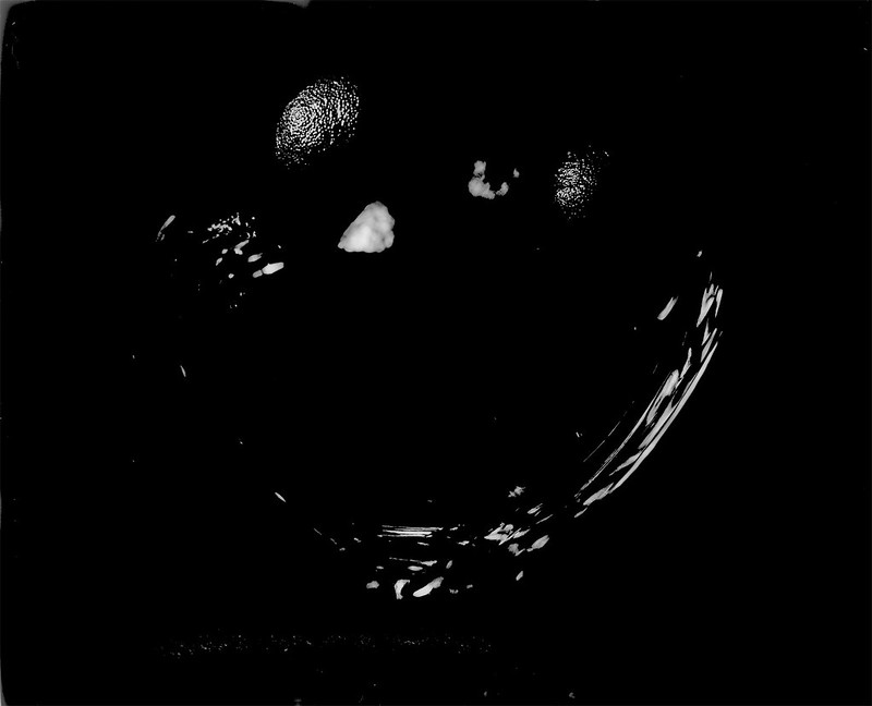
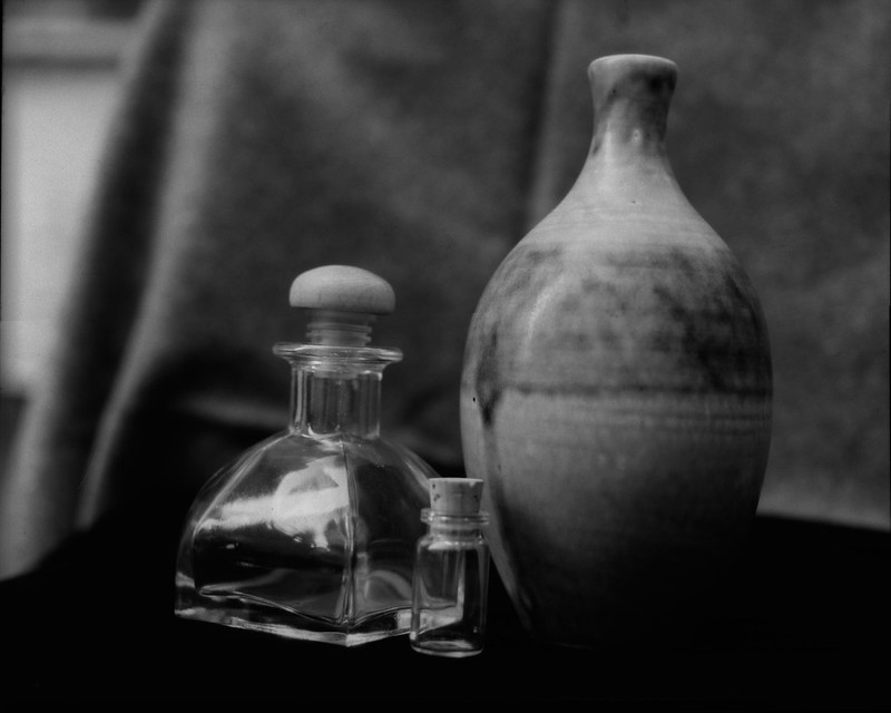
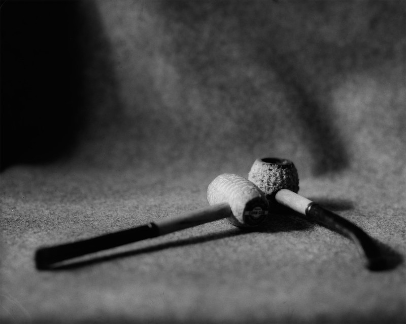
Showing posts with label 4x5. Show all posts

Wednesday, December 23, 2020

Shoot Like Your Grandpa

This shotgun belonged to my great grandfather Roy Harr. It is a 2-round German Mauser bolt action Geha shotgun in 12ga. Now there's a lot to unpack there, but let me start by tying this back in to one of my previous "Like Your Grandpa" posts. In the first post in the series "Shave Like Your Grandpa" I talked about rituals and how we (mostly men) thrive on them. That was in the context of the shaving ritual, but shooting is not really different. In fact, I would argue that for shooting or handling any dangerous object, a ritual is critically important. Shooting is a rather long and involved ritual, especially with antique weapons like this. When you first lay your hands on a weapon, the first step in the ritual is to check to make sure that it is 'clear' (that is, not loaded). Then you might inspect it to make sure it is clean and in good working order. Once you are in a safe place to fire, you would load the weapon and at this point there are a number of safety "rituals" to follow (keep your finger off the trigger, don't point it at anything you don't want to destroy, etc.). Then there is the ritual of actually aiming, firing and in the case of bolt action firearms, ejecting the spent round and chambering the next. Attention to detail and doing things in the right order are important. So this is the appeal for me. I'm not a hunter. I'm a hobbyist. I shoot paper targets at the shooting range for fun. Part of that fun is getting the ritual right and seeing a good result.

Now about this shotgun... When Germany signed the Treaty of Versailles ending WWI in 1919, they agreed to not produce military arms. They could produce 'sporting arms' though. Now they had a large surplus of Mauser military rifles, so what to do with them? Melting them down seemed like a waste of a resource, so they decided to convert the rifles into shotguns. The shotguns were sold to farmers and hunters under a few different brands, Geha being one. My great grandpa Harr probably bought this new and used it on his farm in Washington state. When it was eventually handed to me by my uncle it hadn't been fired in many decades. I cleaned it and took it to a gunsmith to have it inspected. He said it was good to fire. There are many arguements in the shotgun community as to whether these are actually safe to fire. There are apocryphal and third hand stories of catastrophic failures, but I've yet to read anything that leads me to believe that they are dangerous in any systemic way. Remember these were built to withstand the high pressures of military rifle ammunition and so are "over-built" for the lower pressure of shotgun shells. The shotgun holds 2 rounds. I like to shoot a shell with bird shot followed by one with 00 buck shot. It's fun to feel the difference in the two rounds one right after the other. Of course the bird shot obliterates the paper target, so you can't really see the spread of the buck shot after that, but it's really just about the experience. No one shoots stationary paper targets at the range to improve their accuracy with a shotgun.

  • Camera: Standard Cameras 4x5 1.0
  • Film: Kodak Clinic Select Green x-ray film
  • Developer: DIY Parodinal 1:100 x 4 minutes
  • Fixer: Sodium Thiosufate/Sodium Sulfate basic non-hardening fixer

Friday, November 6, 2020

Shave Like Your Grandpa

I am starting a series of posts that center around the things that I do that are anachronistic. They belong to a previous time; that of my grandfather. These are not necessarily things he did or used personally, but are of his generation (give or take a generation). The photos will be taken on film, of course, but the posts will only have the minimum of detail around the actual photo. The content is really about the particular thing I am photographing.

I do some things in an 'old fashioned' way because I think that the world of 80 or 100 years ago was less rushed, less frantic, less worried about leaping from one instant gratification to the next. That slower pace and methodical approach to life is very appealing to me these days. Don't get the impression that I am a luddite. I work for a modern software company and spend many hours a week sitting at a computer writing code and emails and whatnot just like many many others. I don't hate technology, but I think it has its place in my life and there are other places where it does not belong. For example, shaving...

Shaving is a ritual. Whether you shave dry wih an electric shaver or use a plastic disposable with a can of shaving gel, you have a process. I think most men today use either an electric shaver or a multi-bladed cartrige with some sort of shaving foam to lubricate their skin. This is a very efficient way to get through the process with as little thought, time, effort and risk as possible. It is still a ritual, just a short one. I used to shave that way, but I was never satisfied with the quality of the shave I got, nor the feeling I had when the 'ritual' was over. I shaved once or maybe twice a week because I dreaded it an a clean shave was not required for my job. I remembered that my dad used a 'safety razor', so I decided to give that a try. A single blade... how was that going to work? As it turns out, it worked pretty well. I learned the 'grain map' of my face and started getting the closest, most comfortable shaves of my life. When I decided to add shaving soap and a brush to the ritual, it became truly enjoyable and an opportunity to 'pamper' myself. The final straw that made me go 'full grandpa' was the decision to get a straight razor and learn to shave that way. Now the ritual has expanded to stropping and occasionally sharpening the blade. My shaving ritual now takes about 35 minutes every other day. I put on some good music and take my time. My world slows waaaay down and I stop thinking about all of the external troubles. This is by choice and by necessity. Putting a razor-sharp blade to your throat requires some care and focus. So that's why I shave like my grandpa.

The first photo is of my safety razor, along with my badger brush and a bowl for lathering the soap.

Shave Like Your Grandpa 1

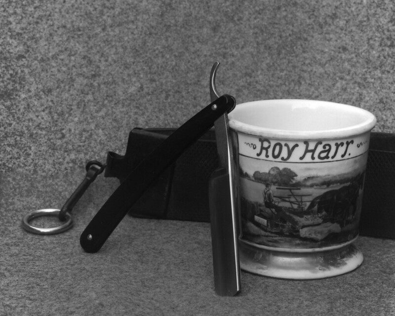
Next up is my straight razor (Dovo) along with a mug that my great grandpa's sister hand painted for him. He used it for lathering his shaving soap and that's what I use it for as well. The leather strop behind belonged to another grandpa. I don't use it because it is pretty worn with lots of nicks, but I keep it hanging with my new strop.

Shave Like Your Grandpa 3

The photo details:

  • Standard Cameras 1.0 4x5 camera
  • Kodak Ektar 203mm/7.7
  • Cat Labs XFilm 80
  • HC110b x 8.75 minutes

Saturday, August 3, 2019

Controlling Weird Film

Sometimes I buy 'weird' film on a whim. I was recently noticing that my supply of 8x10 Kodak Clinic Select Green x-ray film was running low. I bought 100 sheets of it a few years ago and for the most part I cut it down to 4x5 sheets and shot it in my Graflex Speed Graphic. I had good luck developing it in various developers using the Mod-54 device. The emulsion is very thin and on both sides of the film, so it tends to get scratches where the Mod-54 holder grips it. But other than that I was happy with the results. So I went looking for some more. I found it, but not before I noticed a box of Kodak Camera 2000 film in 10x12 for sale. That's 6 sheets of 4x5 per sheet of 10x12, so that made it very cheap to shoot, but I knew nothing about this film. So the research began. Turns out that it is copy film for line art and half-tone images (like newspapers print with the grid of little black dots of varying size to create the illusion of grey scale). So it is a 'black-or-white' kind of film... very high contrast. The only example I could find of true pictorial use was from Mike Rasso on Flickr. Even then he had only posted a couple of shots. They were contrasty, but not terribly so. The catch was the iso. He had shot it at iso 0.8! Now that's some slow film. But if you have read many of my other posts, you will know that I'm not afraid of low speeds. You might say I'm a low speed junky. So that was it. I bought the box and set about reading the Kodak spec sheet in anticipation of taming this beast. It is ortho-chromatic. That is to say it has no sensitivity to red light. That's a bonus when it comes to cutting 10x12 sheets down to 4x5 since I can work under a safe light and don't have to operate the guillotine cutter in total darkness. The base is 'thin'. I read this, but didn't really realize what they meant by that. I have used thin base films in 35mm and it can be a bit of a hassle, but this was large sheet film. Certainly it wouldn't be THAT thin. But it is. It's really thin. That makes tank developing a little more tricky. You can't slosh it around or it will come out of the Mod-54 tracks and stick to other sheets and hilarity will ensue. The one thing I didn't anticipate was that it is not notched. So it's difficult to tell which side is the emulsion side. I took a sheet out into the light and looked at it. One side is shiny brown and the other side is shiny purple. Neither one gave an indication by visual inspection that it was emulsion. So I put a drop of developer on either side. Sure enough, the purple side turned deep brown and the brown side stayed brown, no change to speak of.
The next question was "Which developer will make the best negatives?" My go-to is Parodinal (DIY Rodinal), then My-tol (DIY X-Tol), but for this I thought I would try an off-the-shelf developer. So I bought my first bottle of HC110. This is a legendary developer for those who wade into the miry waters of long-expired film. It does a good job developing the exposed silver without bringing up the base fog. I thought I would give it a try on this odd-ball film to see if I could coax some length into the tonal range. So I tried a high dilution (Dil. J) which is 1:150. For the first go-round I thought I would do tray development under safe light since I had no idea how long I would need to develop this stuff. As it turns out it's still hard to see how far the development has progressed, so it's still largely a guess. My first try I shot at iso 6 (by accident) I pulled at 6 minutes. That seemed really short, but I could see an image and didn't want to over-develop (I'm scanning, not wet printing). Here's the result:
That looks pretty good off the scanner. If I zoom waaayyy in, there is no detail in the darkest shadows. In fact, you can see the weird 'plaid' pattern of the substrate. That means there is really no exposed silver there and it happens with thin negatives, but at 'sharable' resolutions, it looks fine. It is too thin to ever use for either contact printing or wet enlargement. IT's okay. I got an image with a full range of greys and little to no grain at all. I'll count that as a success.

The next shot was at iso 3 and developed for 8 minutes. The negative was still pretty thin. Here it is. You can see that the handle of the knife and the bowl of the pipe are a bit lighter and the highlights on the blade are a bit whiter. Overall there is more contrast, but it is still manageable. The negative is still too thin for printing, so maybe a little stronger developer is called for.

I have in the past added a little bit of Parodinal to dilute developers to give them a 'boost' and put some meat on otherwise bony negatives. So next I added the same amount of Parodinal as HC100 (1:150 of each, bringing the 'developer' dilution down to 1:75). I also bumped the iso down to 1.5. This negative is definitely lower in contrast, but not really more dense. You can also see the fog rolling in around the edges. This is heading in the wrong direction.

Finally, I shot one at iso 0.8 like Mike Rasso. It just exaggerated all of the problems with the previous one. There is definitely a LOT more experimenting to do with this film to get it where I want it. Good thing I have 600 sheets of it!!

Saturday, June 8, 2019

To 85B, Or Not to 85B...

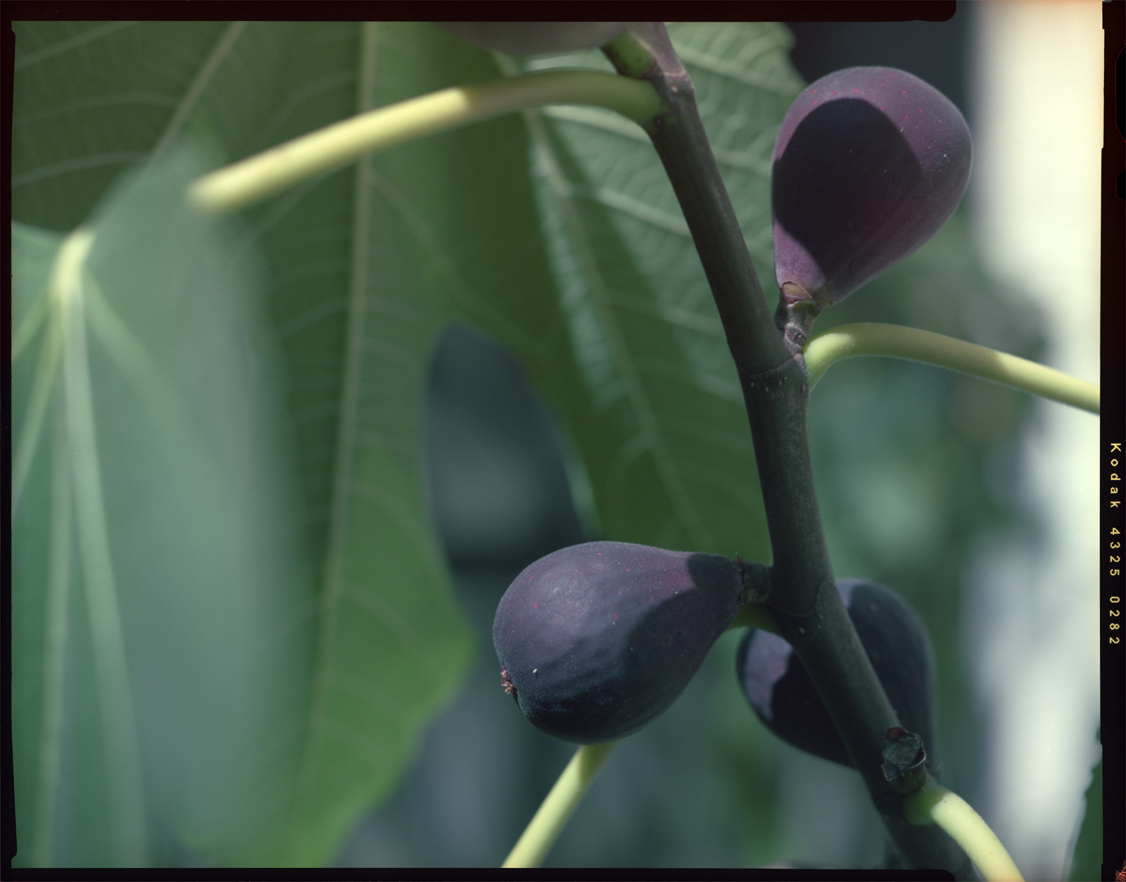
I have a box of 4x5 Kodak 4325 Commercial Internegative Film that expired in 2004. I got it cheap, as I do most of the film I shoot. Internegative film was used to make a negative from a color corrected positive that would then be used to make positive copies for distribution. Normally you see this in the motion picture industry using 35mm stocks, but I suppose magazines and such could use the same process with sheet film. As you might imagine, this was not intended to be used 'in-camera'. It is copy film that would be used in a very controlled environment in a copy machine of some sort. It is tungsten balanced (again not for daylight use) and very fine grained. After all, if you went to all the trouble of making a good positive, you don't want to lose information by copying onto grainy internegative film. With very fine grain comes a very low ISO rating. I rate this film at about ISO 1. That is really slow. I could go as high as 5, but 1 is easier for me to remember. Why is 1 easier to remember than 5?? The human mind continues to be a mystery.

Being tungsten balanced means that colors look 'normal' when this is shot under tungsten (incandescent) light which is a warm yellow color. Out in the daylight which is a bright slightly blue/white, things look quite blue. The 'analog' solution to this is to use color correction filters. These are filters you put on the front of your lens to change the color of the light entering the camera from something like daylight to something like tungsten (orange filters), or vice versa (blue filters). Since I have tungsten balanced film that 'expects' yellowish light and I want to shoot out in the blueish sunlight, I need the orange filter known as 85B. There is an 85C also that is less intense for use later in the day when the light is already turning orange outside.

I took a couple shots of the same thing out in the garden, one without a filter and one with the 85B. Then I developed them normally in C-41 chemistry and scanned them, only adjusting for contrast. Then I took them into Photoshop and corrected each of the RGB histograms, adjusting them each to full scale. Then I masked off the left half to see what the image looked like out of the camera compared to what it looked like corrected in PS.

First the unfiltered shot:

unfiltered

And the one with the 85B:

85B filtered

Looking at the left half of each shot, you can see a clear difference made by the filter. On the right side that has been further corrected in PS, the shadows are still sort of blue/green on the uncorrected shot. I could probably work that out with some more time and effort on the computer, but the point of being careful and intentional with analog photography is so that I don't have to spend my life on the computer. I want to make nice photos in my camera and on the negative. Sometimes that means putting a filter on the front of my lens to get the colors looking the way I want them.

Finally, here is a shot out in the broad daylight, also shot through the 85B. This one is a little more colorful and interesting. It is your reward for reading through my article, so enjoy!

Squash flowers

Monday, January 8, 2018

Reversal Revisited

If you remember this post about reversal processing images taken on photo paper (enlarging paper) in-camera, then this might be of some interest. I have done some more experimenting. At first, I made the terrible mistake of changing too many variables at once. I was trying different papers and rushing through the processing procedure and the results were all bad. In order to understand a process like this, you have to isolate a variable and just change that incrementally so that you can see what effect that variable has on the end product. So I decided to just use one paper (Arista Grade 2), one camera (Graflex Speed Graphic with the Graflex Optar 135mm lens), and one dev/reversal process (outlined in the aforementioned post). So I took 4 shots of a high-ish contrast subject. I only varied the exposure. I used iso ratings of 0.25, 0.5, 0.75 and 1.0. I know those seem like extremely low ratings, but it turns out they are in the right ballpark. I started here based on some vlogs by Joe Van Cleave as well as some initial Googling and experimentation. Anyway, I wanted to share my results, so here goes.

These are in order of low to high iso rating. The subject is a scooter and a padlock against a brown fence in direct sun. The exposures were all done at f/16 and the times were 4, 2, 1.5 and 1 second respectively.

I can tell very little difference between the last two, but they both look about right. They might tolerate a bit less exposure, but for a regular scene with more mid-tones, I think iso 1 will do nicely. So here's what I think I am learning about this process. Expose more than you think you should. Develop to completion on both dev steps. Stop and wash completely! Keep the bleach fresh (I make 300 mL and discard after 4 sheets). If you have bleached adequately, you don't need to restrain the second exposure. I am using bright bathroom lighting for 2 minutes.

Now the next step will be to make exposures in my Ansco 3A and get some postcard format pictures out that I can send to my analog photo friends. I might even try tank developing those and see what happens. If you are doing reversal processing, drop me a comment and let me know how it's going.

Sunday, July 23, 2017

Moving Forward in Reverse

If you read my article on lumen printing, this is sort of an addendum or appendix or epilogue or sequel. I had the paper cut, but for the lumen prints, I had cut it in sort of dim diffuse room light, so those pieces are really only good for lumen printing since they are a bit exposed already. So I went and cut some more 8x10 Agfa Multicontrast paper under my red led headlamp (hung about 30" above the work surface). Those pieces went directly into film holders. I had read about reversal processing film a while back (reversal processing is how slides or transparencies are made) and was sort of interested, but the bleach put me off. Most reversal process bleach is made with dichromate or permanganate compounds which are pretty toxic and best avoided if possible. So I shelved the idea of diy reversal. Then I read an interesting article about a fellow who made a working reversal bleach with just household hydrogen peroxide and lemon juice (the active ingredient there being citric acid). WHAT!? This I've got to try. I didn't have any film ready to develop, so why not try with the papers? It's more or less the same emulsion, just with a different base and in the case of RC paper like mine, a different top coat. What the heck, let's just experiment!. The article called for caffenol for the development steps, but I didn't have any of that ready to go. I did have some homemade my-tol(X-Tol knock-off), so I figured I'd just use that at stock concentration and see what happens. I read on APUG that you can develop paper with X-Tol stock for about 5 minutes, so that's where I started. Here is an overview of the process I used (note, I used 9g/L dry citric acid in place of lemon juice):

>
STEPTIME
1st developer (my-tol)5 min
Wash5 min
Bleach (cit. acid-hydrogen)11:30 min
Wash5 min
Re-exposure 300W at 1 meter2:30 min
2nd developer (my-tol)5 min
Wash5 min
Fixer5 min
Final Wash5 min
Wetting agent2

The first sheet I did with straight stock my-tol for 5 min in both development steps. Here it is. This is a straight color scan without any added colors, curves or contrast.

A couple of notes worth making here... I was tray developing under red light so I could see what was going on. After a couple of minutes in the first developer, the paper looked completely black. I couldn't see any image at all. I was a little worried, but I kept going because I knew that this was not necessarily an indication of failure yet. The bleach brought out a little bit of an image. I could just make out some light areas. Once I turned on the room lights for the re-exposure step, I could tell that the image was there still. It looked bad and was very low contrast. I thought, "well I guess I'll have to correct it in post." That's not what I was hoping for with this process, but sometimes that's all you get. But then I poured in the 2nd developer (same developer as I used in the first developer step) and there was the image, nice and crisp and contrasty in tan and deep black. That is when I got excited. The fixer didn't change the image since there really isn't any undeveloped silver left at this point.
The next set of exposures I did with 1:1 my-tol, thinking that I might lower the contrast a bit. Unfortunately, I was tray developing these together in an under-sized tray and so there are artifacts where the sheets contacted each other. But these are experiments, not art. What I was trying to see was whether the dilute developer would lower contrast. I don't think it did. Maybe more dilution or a different type of developer (vit. C based like caffenol or parodinal) would work. Maybe something as simple as preflashing the paper would work. These are all variables that can be explored.

So there you go. I think I really like this process. If anyone else has experience and wants to share some tips, please do!

Wednesday, July 19, 2017

Lumen-osity

I have not been a fan of the lumen print. Let's just get that out there. If you are, then keep reading (spoiler alert: I am now). Recently, over on Filmwasters, there was a discussion of the 'Lumenbox' which is a box camera designed with lumen printing in mind. But I'm getting ahead of myself. What is a lumen print? For that matter what is a lumen??

lu•men


/'lōōmən/
noun physics
the SI unit of luminous flux, equal to the amount of light emitted per second in a unit solid angle of one steradian from a uniform source of one candela.

I'll wait while you go look up "steradian"... Now that that's out of the way, lumen printing is simply the process of using regular black and white photo printing paper as a print out paper (POP) medium. That means you get a negative without using any chemical developer. Now in this case that may not be strictly true, but we'll get to that in a minute. So why the turn around on lumen prints James?? Well, I have really only ever seen contact prints of leaves and flowers done as lumen prints. I have nothing against leaves and flowers, but the lumen contact prints just didn't appeal to me. I don't have a good reason, it's just "because". Back to the Lumenbox camera. This guy put a simple meniscus (single element) lens on the front of a box and put a piece of photo paper in the back. He did this all in daylight, knowing that the paper, without being developed, is not very light-sensitive. He pointed his camera at something stationary for 15 minutes and pulled out a photo! Now I was a little intrigued, but not enough to buy one of his cameras... just interested. Then on Filmwasters, the people were discussing the camera and lumen printing in general and who else but Joe Van Cleave posted a couple of videos (vid 1 and vid 2) about some experiments he did with this method and his own little box camera. That really piqued my interest, especially the idea of integral developer (developer embedded in the emulsion of the paper). He and the Lumenbox guy both took the image using wet paper. The idea there was to wet the paper first and then expose it and the water will allow the integral developer do its thing while the exposure is taking place. To me that seemed overly complicated and potentially messy, especially as in vid 2, Joe puts a wetted paper into his Speed Graphic. That's a risk I'm not willing to take. So I thought if the developer is there, then there's no real reason it has to be 'activated' during the exposure. The light is doing its thing to the silver halides and the developer can wait, just like with any expose/develop process. The integral developer is intended to speed up processing, not raise the effective ISO. So it shouldn't matter when you wet the paper and activate the developer. So my thought was to expose the paper dry, then dunk it in some water to let the developer do its thing. So that's what I did. I cut a piece of paper down to 4x5 and put it in a film holder and put that in my Speed Graphic. Then I set the aperture wide open to f/4.7 and put the shutter on 'T'. Then I pointed it at a ponytail palm on my patio that sits against a white wall and left it there for 20 minutes.

I scanned and inverted the dry paper right out of the camera and got this:

That's not bad! It's a little blue, but if you don't like that it could be desaturated:

So then I thought I would try some alkaline water to really get that developer kicked in the acid! I put a pinch of washing soda (pH 11!) in some water and dunked the paper. I could immediately see things starting to happen... Bad things!! There were blobs and streaks and uneven shading and, well you get the point. The integral developer had either already reacted with something else, or was breaking down in some unpredictable way. But this was the result.

At this point the negative is destroyed, but I figured it was worth one more experiment, so I put it into some paper strength fixer (Ilford Rapid Fix 1:9). I will save myself the time of uploading it and just say it didn't help. It might have lowered the contrast a bit, but the blobs and streaks were still there.
So there you go. Lumen printing in a large format camera. I suppose you could try doing optical prints from the negative produced, but it probably wouldn't work. The negative isn't dense enough to really block any light and the light of an enlarger would probably fog the negative during the process. But don't let me discourage you if you are an experimenter. My idea here was to expose dry and then get it wet to 'develop', but what I learned was that there really isn't any need to have any aqueous involvement at all. The dry lumen print stands on its own. I hope this is informative for someone. If you see some glaring error in my logic or process, please leave a comment and we can all learn together.

Sunday, June 4, 2017

Gone Microfiche-ing

Using expired film can be a bit of a challenge. There is usually some loss in speed, so the apparent iso (or the effective EI, if you like) is lower and it is up to you as the film adventurer to determine by how much. The rule of thumb says one stop for each decade past its expiration date. So assuming you know the expiration date and didn't just come across a random roll of film, you can use that as a starting point. Keep in mind though that 'fast' films (to me that means iso 100 and higher) will lose speed 'faster' than slow films. So if you have a roll of Ektar 25 that expired in 1997, that's 20 years (two stops lost), but since it was slow film to begin with, it probably didn't lose a full two stops. Maybe 1½ or 1 stop would be a better starting point. "So what's your point here Jimbo?", you may be asking. First, I don't really like "Jimbo", people called me "Jim" in college, but generally, it's just "James" and has been since Mr. Salyers' 4th grade class. Secondly, I'm getting there!

Periodically, I search for Kodak Dacomatic Recordak film to buy. I have some in the fridge and I really like it. So I just keep an eye out for a spool. I never find any. But then one day the search popped a result on the big auction site. It was "Recordak", but didn't say "Dacomatic". Additionally, it was 500 ft of 105 mm stock! Well, that seemed odd, so I did some more digging on the specific emulsion number (4462) and it turned out to be a completely different film (seems obvious now). This one was used for microfiche production. So it was copy film like the Dacomatic, but a different type. The price was right, so I went and bought it, hoping against hope that I could get pictures from it. It originally (expired 12/1979) was rated at iso 2.1! So, figuring that this stuff is really not very sensitive to light to begin with, I figured it probably hasn't lost that much speed even in almost 40 years, but I'll give it a stop anyway. That puts it right about iso 1. Okay, so I have an exposure starting point. How am I going to develop this stuff? It was designed with an automated proprietary development scheme in mind, so all I could find in the VERY sparse documentation was "Microfilm DEVELOPER and Replenisher". That's it. So I figured I would hit up the old stand by, Rodinal 1:100 and do a strip test to see if it would even change color. In fact it did! In about 15 seconds, it was fully developed!! So much for 60 minutes of stand development. Well, I cut a few sheets and took some of what I am certain were the best photos of my entire life and dunked them in what I had on hand, which was some homemade Parodinal 1:100 for 4 minutes. That is what I use for x-ray film and it works just fine. This microfilm however, was completely dark. Hmm... Maybe I over-exposed it? I tried again, taking more absolutely stunning photos at higher and higher speeds. Again, completely dark. So over-exposure was not the problem. It must be over-development. I cut the time in half. Still totally dark. I mean just a dark sheet of film... No image whatsoever. The strip test I did showed that the film cleared completely in the fixer, so it wasn't that the fixer was bad or the film was totally fogged.
I was just about to give up and call it a total loss, but I thought I would just try a different developer for grins. Rodinal variants have always developed anything I threw at them, including a roll of Ansco Plenachrome expired in 1949. But desperate times, you know. I had some X-tol powder laying about and that is a phenidone based developer, so I figured one last try. And this time, I would take a high contrast shot with lots of bright San Diego sky AND I would develop under red safelight by inspection. Did I mention that this film is orthochromatic? No? Well, now I have.
BAM!!!

Recordak-iso-1

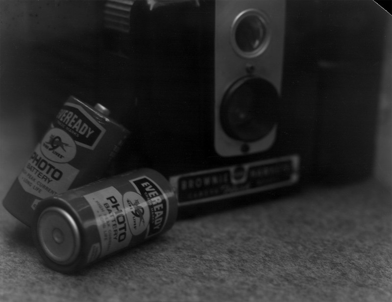
I got an image! That was in X-tol 1:3 for 10 minutes. Now to see if I could get something with a few more grays in there. So I took a shot in the shade. I gave it a little more exposure because I had the bellows extended a bit, but I forgot about the reciprocity failure that was mentioned in the tech doc. The negative was very thin, but still there was a photo and it had much more scale to it. It is still quite fine grained and in 4x5 sheets that means some super fine detail can be had.

Retro Eveready Photo Cells

Now I've got about 490 feet left of this to see what I can do with this flavor of copy film. I'm looking forward to making some photos with this oddball microfilm.

Tuesday, December 13, 2016

Strange New Development

I am unafraid of getting chemicals on my hands (figuratively) and mixing up concoctions. I have spent my share of time in the lab and have even blown a couple of things up, so mixing up photochemistry is not a problem. Additionally, I am comfortable with a certain amount of uncertainty in my photographic outcomes. I don't shoot weddings anymore, so no world is going to end if I totally screw up what I am doing. So when I recently became aware that X-tol and Rodinal could be mixed and that the results might encapsulate the best of both of those developers, I was on it. I had some X-tol powder that I weigh into 1L portions and I had some Parodinal, so I figured I would shoot some 4x5 Kodak CSG and some Arista Ortho Litho and see what came out of it. Normally, I would develop CSG shot at iso 80 in parodinal diluted 1:100 for 4.5 minutes, so I used that as a starting point and at the last minute decided to cut it in half. I shot the Arista at iso 3, but I haven't worked much with this film, so I don't have a standard development for it. My standard dilution for X-tol is 1+3. So 250 mL of X-tol, 5 mL of parodinal and top off to 1L. Nothing exploded, so I figured I was good to go. I chose 5 minutes with 4 inversions every minute. The temp was probably around 68F. Stop was with tap water, changed 4 times. Fix was 2 minutes in Ilford Rapid Fix. Both of these films have extremely thin emulsion layers and actually fix in about 15 seconds.

The Ortho Litho turned out with VERY high contrast as might be expected. Here are a couple of the shots.

SpeedGraphic-AristaOL-pan01
SpeedGraphic-AristaOL-pan03

The CSG was much more tame and the negs looked 'normal' as far as exposure and density goes. I think the grain might be a bit smoother with this X-tol based developer. Hard to say without some sort of side by side with the same exposure of the same subject, but my gut says it is smoother. I know, not very scientific, but this is my hobby not my job. I don't have to be quantitative if I don't want to.

SpeedGraphic-KodakCSG-pan01 SpeedGraphic-KodakCSG-pan02

Sunday, October 9, 2016

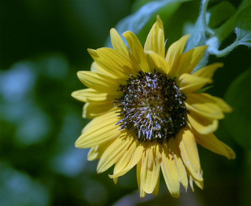
Apples and Oranges... and a Sunflower

I have wanted to write a little comparison article about these two films I have for a while, but you know... life... I finally got around to developing some sheets I had exposed months ago and I was happy to see that I had taken the same photo with each of these films. So, let's get to it.
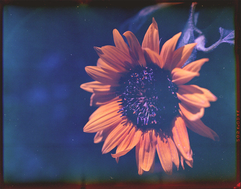
First, let's get the variables out of the way. Both are 4x5 sheets taken within minutes of each other with my trusty Graflex Speed Graphic with the nice Graflex Optar 135/4.7 lens mounted. This was in early summer in the full mid-day sun. Film #1 is Kodak Vericolor II expired in 1997. This film is tungsten balanced, so shooting it in sunlight gives a blue cast. This can be corrected either by putting an 85 color correction (warming) filter on the lens or applying it in post. I do the latter. The problem with this particular box of film is that I don't think it was stored well and the base is fogged. Also, the edges drop off suddenly. I think the original box speed was around 80, but I shoot it at iso 25 to try compensating for the base fog. However, with all of these flaws, it can make some interesting and dramatic photos. Please excuse the dust on this, I hadn't really planned to share this, so I didn't dust spot.
Graflex_Vericolor2_1
You can obviously see the blue shadows and the high contrast. I could let the shadows drop out, but then I would just have some orange flower petals floating in space. I would rather let the film's character shine through and appreciate the uniqueness.
Next is Kodak Internegative Film. This was intended to make a positive duplicate from a negative which would then be used to make more negatives. Alternately, it could be used to make negatives from slides which would then be used to make prints. So it wasn't really intended to be a 'pictorial' film used in the camera. It was meant to be used in a commercial enlarger. With that in mind, I am shocked at the quality of this film. I don't think there was a set iso. The technician would have to test and adjust exposure depending on the original and any filtration they were using in the enlarger. I shot this at iso 5.
Graflex_Internegative_3
The colors are beautiful and the grain is nice and smooth. As I discovered when I scanned these and as I said in the title, these two films are not 'comparable'. So in that respect this little experiment failed. But that is not to say I didn't learn something. I found that the internegative film will produce nice smooth, accurate photos at iso 5. With a moderate scan resolution, this makes a 90 megapixel image that can be enlarged to any size you like. On the other hand, the Vericolor II makes a more unconventional/challenging image that brings a layer of abstraction to the subject. This definitely has its place in most film photographers' repertoire.
Here is another example of each film just for good measure. Enjoy.

Monday, December 15, 2014

The Flying Leatherneck Aviation Museum

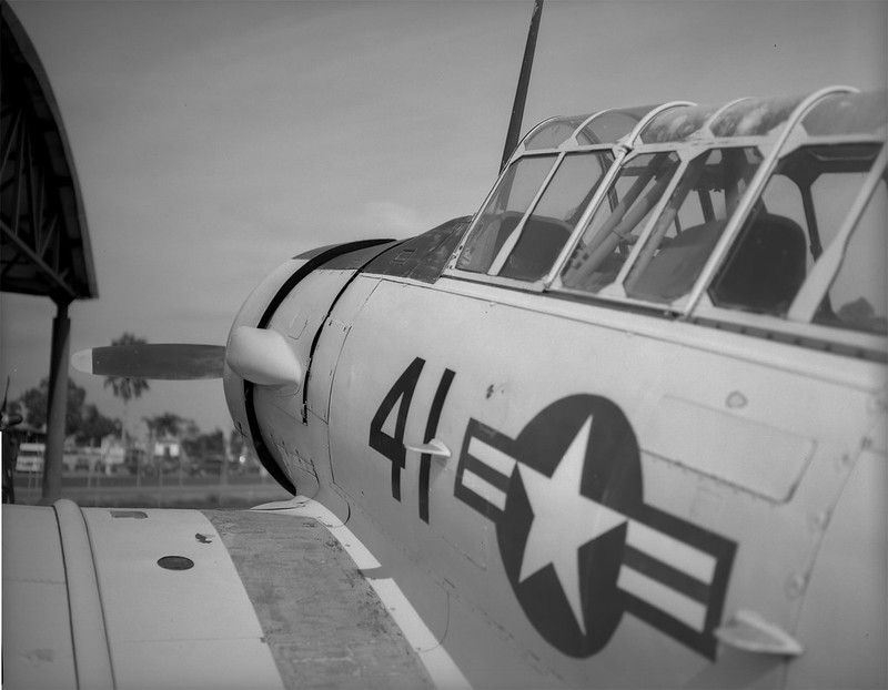
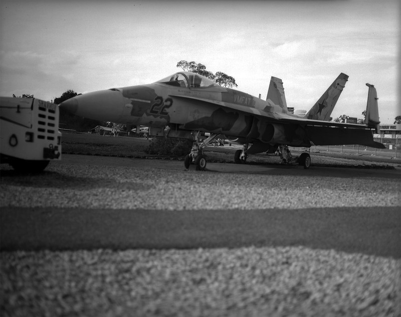
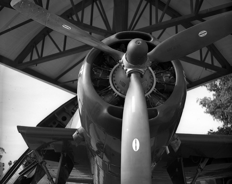
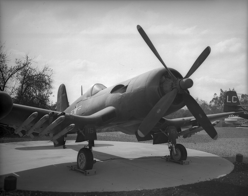
Ever since I was a little kid, I loved airplanes. The thought of flying was the most thrilling thing I could think of. In 1976 when I was 9, a show came on TV called Baa Baa Black Sheep. It was about Marine Attack Squadron 214, AKA The Black Sheep Squadron. This was a squadron of 8 F4U Corsairs, which immediately became my favorite fighter. I guess it still is. I love the look of the plane. The inverted gull wings and the enormous engine make it so unique and in fact proved to be a formidable fighting machine, serving from 1942 - 1953. But I really just like planes in general, so when I get the chance, I drive a couple of miles over to MCAS Miramar where the Flying Leatherneck Aviation Museum is. Last week I went over and took my 50's vintage Graflex Speed Graphic with a Graflex Optar 135mm f/4.7 lens and some sheets of Ilford Delta 100 film. The day was cloudy, so exposures were a little tough. Working with a large format camera means you are taking time to do everything and double checking it all before you trip the shutter. On days when clouds are covering and uncovering the sun every 30-60 seconds, that's a problem. So I just took an average reading and figured I would stand develop the film and that would correct for overs and unders. So here are the pics from my day at the Flying Leatherneck Museum.

Leatherneck 7 Leatherneck-8 Leatherneck-9 Leatherneck-4 Leatherneck-2 Leatherneck-5

Monday, October 6, 2014

Flash Bulb Magic

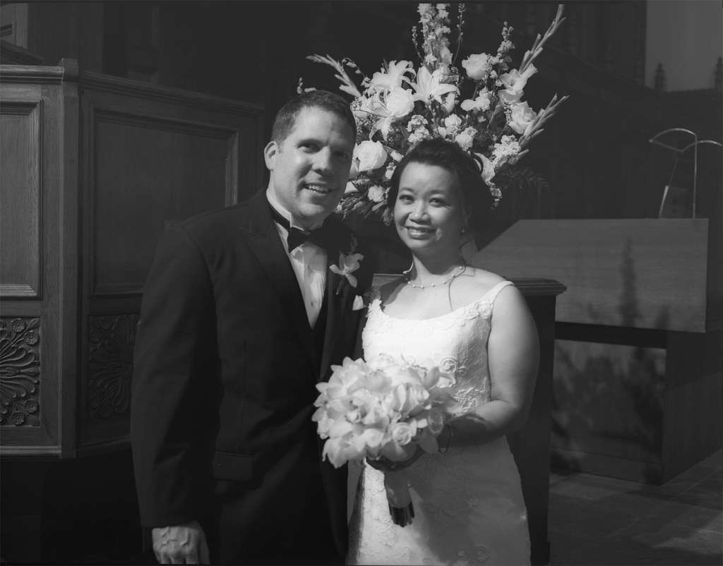
I shot a wedding last weekend for two dear friends. The days before the wedding were fraught with the anxiety of shooting a wedding and what gear to take. The DSLR went with a short prime telephoto and the bride lent me her better-than-mine DSLR with a medium telephoto. So that covered the "safe" option. I would get all of the photos that I "expect" from myself when shooting a wedding. Now... what to take to get the photos that I "desire"? 35mm format is covered by the digicams, so I left the 35mm film cameras at home. If I was going to carry the weight, I should make it count. Medium format: Yashica Mat 124G (I only took 2 or 3 with that) and Brownie Hawkeye Flash Model (I think I only took one with that). The sanctuary was pretty dim, so the film I generally shoot with was too slow for moving subjects. You think that people getting married are just up front standing still, but they aren't. They are fidgeting and looking at each other and then at the pastor and then they go light candles, etc etc. After the ceremony, I did all of the formal family & friends photos, again mostly digital, but I did keep one surprise in reserve. The Graflex Speed Graphic! I brought this monster out to the enthusiastic "oooh's" and "aaaaah's" of the expectant crowd (okay, that may be a bit hyperbolic). Pose; meter; focus; aperture; focus; meter; aperture; dark slide out; cock shutter; focus; "One-Two-Three---CLICK"; dark slide in.

Portrait1

If Kodak Tri-X 320 was a food, it would be butter. I developed this in Adox Adonal 1:100 for 70min with agitation at 0 and 35min. You might think I did a lot of correcting in post after scanning, but you would be wrong... dead wrong. Now get your things and get off of my blog! Just kidding. You should stay for the rest. It's going to get good. I promise.

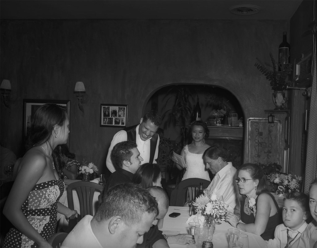
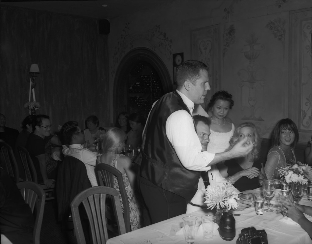
I took another just like that one for safety (good thing too). Then it was off to the reception. It was a small room in an Italian restaurant in La Jolla, CA. I did what I could with the DSLR, but the flash was just making me cranky. I had it dialed down to -2.0, with a cup diffuser, bouncing off the walls and ceiling. Everything short of a soft box to get some light but minimize the shadows. They turned out okay, but I am so used to film, the digital rendering of the scene was just missing something. Out comes the Speed Graphic, along with the flash and 7-inch reflector. I loaded up with Tri-X again and popped in a GE #5 bulb. I had done the calculation the day before. Iso 320, Guide Number at 1/100 sec is 300, that makes if f/30 for a subject 10 feet away. I decided to open it half a stop and hoped that the highlights wouldn't get blasted. Expose for the shadows, develop for the highlights, right? Now there's something about flashbulbs. First, the 7-inch reflector is mirror polished and makes a BIG cone of light that is hot in the middle and falls off at the edges. Also, it flashes over time. It seems instantaneous, but over the life of the bulg, it is starting out dim and soft, then ramping up to full power, then falling off. Depending on where in that cycle the shutter opens, there will be a dramatic difference in the look of your photo. Generally though, the light is on the soft side (for a direct flash) and hot in the middle. The shadows are there, but they aren't the harsh outlines you are used to seeing. So take a look at these two photos I shot at night in a very dim restaurant and tell me there isn't something magic about this flash and camera.

Reception1

Reception2

Thursday, July 24, 2014

Pacific Southwest Railway Museum

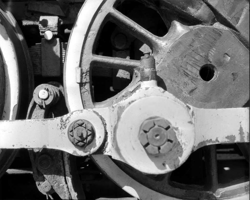
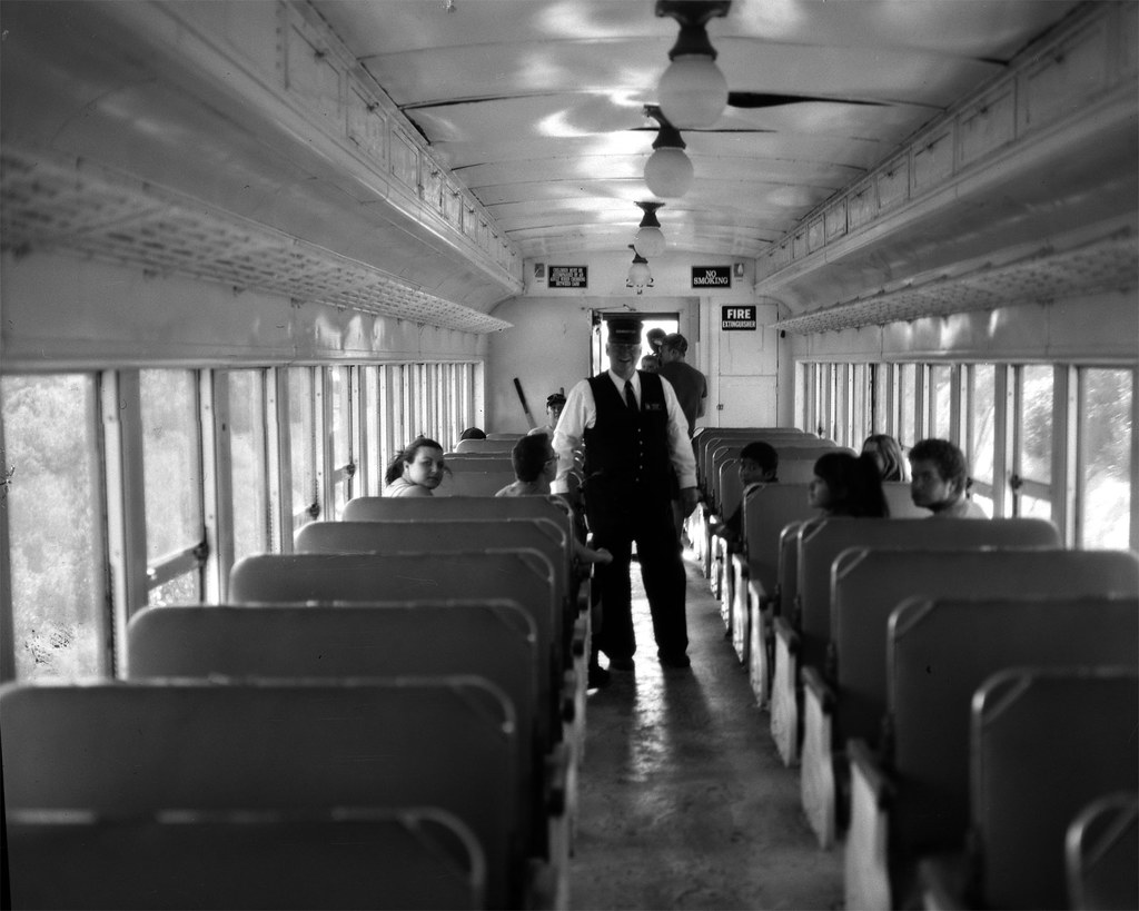
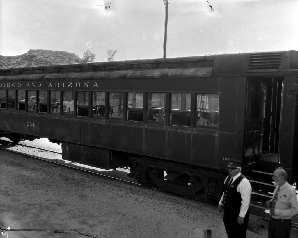
A couple of weekends ago, my family packed up for an outing. We live in San Diego which is pretty hot in the summer, but with two boys in school, we don't have a lot of options for getting out of town. The youngest wanted to go 'camping', but here in So. Cal. the camp sites have to be reserved and they get filled up about 6 months in advance. So there we were without a reservation, wondering where we could go. So with a little searching, we found a small lake down near the border and out east about an hour away. It was going to be hot there too, but at least we could get away from work and 'routine'. One of the up-sides of this location was that it was near Campo, CA and in Campo is the Pacific Southwest Railway Museum. I figured that there would be ample photo opportunities there, so I brought my large format (4x5) Speed Graphic and 6 sheets of Kodak CSG x-ray film. Taking only a limited number of sheets forces me to slow down and consider my shots more carefully. So here are the three best shots from that day.


I have to say that I was pleasantly surprised at the museum. I am not an 'old train guy'. I am an 'old camera guy', but the two are oddly akin. They are machines of a bygone era that hold a fascination for those who still use them. They are more mechanical than electronic, with gears and springs and levers doing the precision work of taking photos or moving people and cargo. The Pacific Southwest Railway is definitely worth a visit. The 12 mile train ride through the rugged California back country is wonderful for all ages. The display house has some great engines and restored cars that you can get right into and feel like you have stepped back in time.

I hope you take a trip down to Campo and see the Pacific Southwest Railway Museum. It is worth the drive and if you bring along your camera, you will be rewarded with lots of great photos.

Saturday, June 21, 2014

Toning Cyanotypes

I've discussed this topic before, but this morning I was doing some experimenting and thought I would share some insights.

First, I started off with a 4x5 Tri-X negative from my Speed Graphic. I scanned it and inverted it to a positive. Then I made a few adjustments and removed any dust spots. That image looks like this.

Nice, huh? I thought so. I needed some prints of this, but rather than sending the negative to a custom darkroom (expensive) or having it digitally printed on a nice ink printer (not the quality/look I want), I thought I would make some cyanotype contact prints right here at home. Of course, I could print using the original negative, but I can only print one at a time and the exposure times are quite long, even in bright sun (around 20min or so). So I decided to re-invert the scan and print it on regular printer paper, then make waxed paper negatives of the image duplicated. Like this.

Then I coated some Canson Aquarelle 140# Cold Press watercolor paper with the traditional 2-part cyanotype formula. UV light penetrates the waxed paper much better than it does the plastic film base of photographic film, so the exposures worked out to be about 4 min. Unfortunately, I over-estimated the time needed and started with 12min, then tried 10min and 8min before I settled on the 4min exposure. So now I had six prints that were quite over-exposed. I could just toss them, but that goes against my frugal nature. I decided I would see if bleaching and toning would recover some contrast. Bleaching is done with dilute washing soda (sodium carbonate). On my first attempt, I had the solution WAY too strong (~1/2Tbs in 2c water) and it completely bleached the print almost immediately. In this picture you can see the over-exposed, unbleached print next to the one I just bleached.

At that point, I diluted the washing soda about 100x and that was much more manageable. Next is the toning step. For this, I use wine tannin. I put about 1/2tsp in 2c water. Some people put these solutions in trays and dip the prints, but I like to just brush them on. It gives me a little more control, I think. So here is a picture of the same two prints. The second one was 'gently' bleached and then the tannin was applied to both.

The lower one isn't really coming back, so that is probably just a loss. This is how we learn. :) I continued on with this method of bleach for a minute or so, followed by a rinse followed by toning until it 'looked right' and I must say that the over-exposed prints actually look pretty good with improved contrast and a little interesting color. It's almost like a split-tone which is a look I like. Here are a couple of the 'correctly exposed' prints after toning.

This is tons of fun and really cheap. I plan to send these off to friends as postcards which is even more fun. I hope this is informative. Put a link to your toned cyanotype in the comments. I'd love to see them!


Addendum:
I decided to make a print out of the 'other side' of the postcard, so I did a quick something in Photoshop, printed it, waxed it and cyanotyped it. I think it looks pretty good and completes the package in an artistically coherent way.

Tuesday, April 22, 2014

Springtime in San Diego

Here in San Diego, California we have two seasons. There is Warm Summer and Hot Summer. Right now we are still in Warm Summer as it is late April and Hot Summer doesn't really get here until late July. But I know that Hot Summer is coming because the Coral Trees are in bloom.

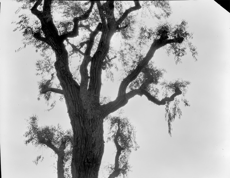
I took this photo with my Graflex Speed Graphic using the Optar 135, F/4.7 lens. I shot it on Kodak Clinic Select Green x-ray film and developed in 1:100 Adonal for 4.5 min standing. I hope you are enjoying the change of seasons where you are.