I may have mis-titled this post since the adventure was not really anything to do with the medium. I will just make a couple of technical notes. The paper was exposed in my Graflex Speed Graphic with the Graflex Optar 135mm f/4.7 lens. It was exposed using an EI (exposure index = iso) of 3. The light was indirect sun from a window, so not very bright and somewhat diffuse. Exposure time was ~ 60s at f/4.7. Tray development was done in Rodinal 1:50 by inspection under red light. I think it was around 10 minutes with fixation in Ilford Rapid Fix (1:4). The 'tray' I used was narrower than the paper, so I had to curl it into a 'U' shape and that may have had an effect on development as agitation was uneven.
Okay, the main thing I wanted to talk about was this. I don't take many people pictures. Look around my Flickr feed and you will see lots of plants and random objects and some landscape. Street photography is pretty much absent from my repertoire, and portraits are uncommon if not rare. Let's just get this out of the way. I am an introvert. I don't naturally connect with people, especially people I don't know well. So going up to people and asking them if I can take their photo is an experience on a level with unanesthetized fingernail extraction. I tried to work this out by starting a "100 Strangers" project. I think I made it to #3. Even though the people I photographed were friendly and good-natured, the negative reinforcement outweighed the positive.
That's probably more than you care to know about my inner psychology, so what does all of that have to do with anything? Only this... My youngest son (not so young any more) is the model for a good portion of the portraits I take. He is always willing to sit down and have his photo taken. It might even qualify as "quality time" since he is just curious enough to ask a question or two about what I'm doing and I am willing to take the time out of what I'm doing to explain it. Maybe some day he will want to start taking photographs himself.
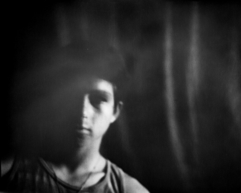
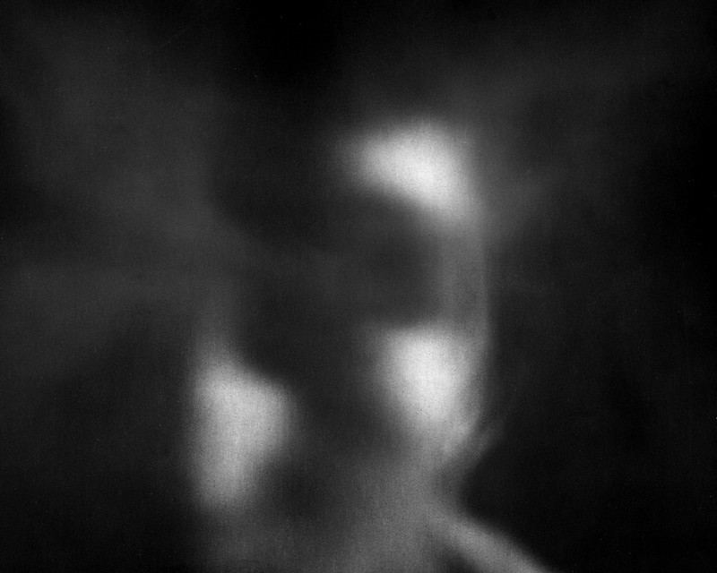
So what was I trying to do with these two photos? I wanted to try some 'non-conventional' portraits that were more implicit than explicit. I wanted to do something to add another layer of abstraction. A photo is inherently abstract since it reduces a 3D object to 2D. Using b/w media is another layer of abstraction since most of us see in color. Removing any accompanying environment or context is a type of abstraction. Then I figured that since I was using a long exposure and not in any way 'stabilizing' my subject, there would be some motion blur. I decided to enhance this by using the on-camera shutter release and then intentionally shaking the camera ever so slightly. The first shot was a close up of Artyom's face. This is even more abstract because it isn't immediately obvious what the subject is. Most of us certainly never see another person from quite this close of a perspective. I would characterize this as "expressionistic". It uses a very abstract representation of the subject to say something about them or maybe just to create a beautiful pattern. Artyom is a 'touchy-feely' kind of person. He likes to get up close to people he likes. This photo illustrates that characteristic without explicitly showing him hugging someone. It is an 'expression' of that trait the way I see and feel it in my heart and mind.
The next shot is a little farther back, so that the subject is more recognizable. The high contrast of the photo depicts him in a certain way, but it does depict him. Anyone who knows him would recognize him in this photo. Artyom is very athletic and strong. This photo is very structural. It shows a stark outline of his shoulder, neck and collar bone. His gaze penetrates out of the photo at the viewer. So this image is what I would call "impressionist". It is an image of Artyom overlaid with the impression of his strength. The purpose of the image is not to identify him, but to identify with him. Please take a moment to comment if you like anything about these photos. I appreciate your feedback.