The first essay, "Truth in Landscape" is a brief but tightly packed essay that explores landscape photography and what it should (and shouldn't) be. Adams explores the possibilities and pretenses of landscape as well as the necessity for it. He talks of three qualities of landscape photography; geography, autobiography and metaphor, and details how the balance (or imbalance) of these can make a photo truthful and therefore meaningful and therefore beautiful. This is a short essay and well worth the brief time taken to read it.
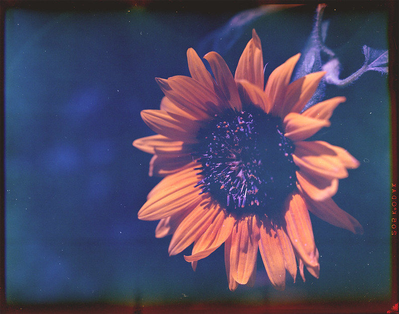
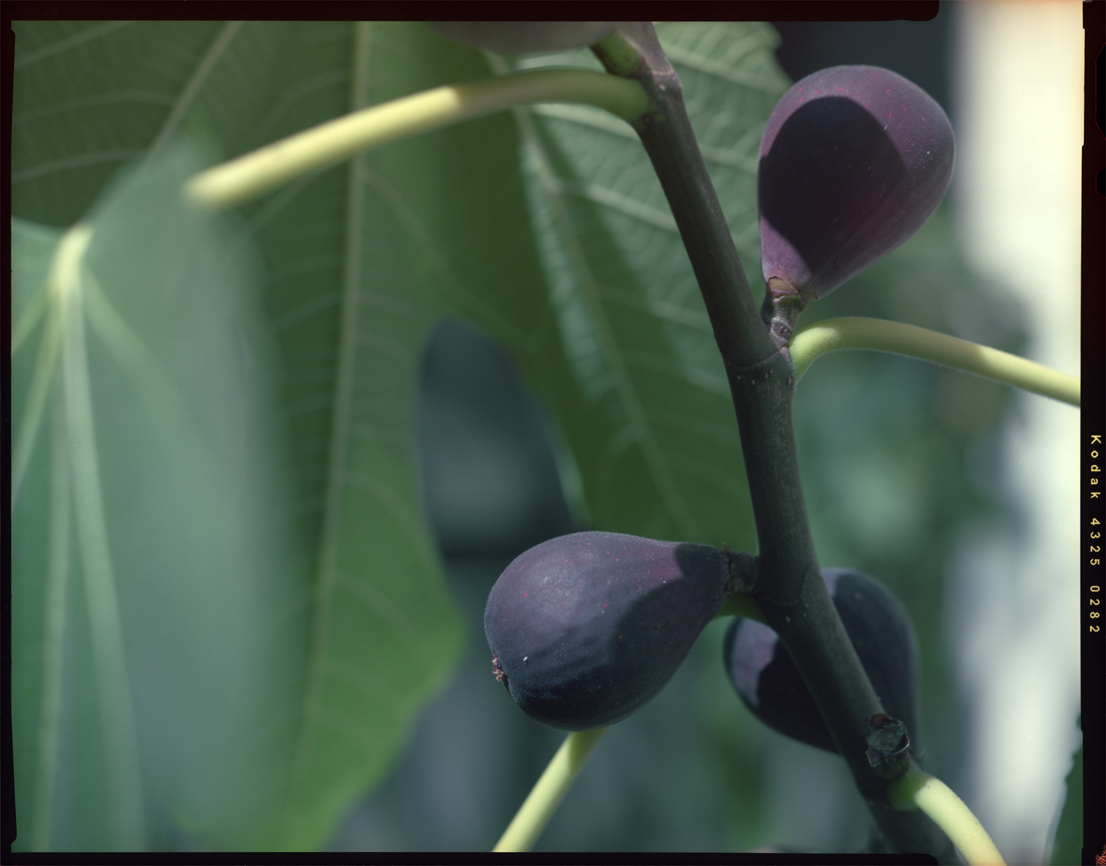
"If the goal of art is Beauty and if we assume that the goal is sometimes reached, even if always imperfectly, how do we judge art? Basically, I think, by whether it reveals to us important Form that we ourselves have experienced but to which we have not paid adequate attention. Successful art rediscovers Beauty for us." This is from the second essay from which the book gets its title. It is a discussion of, you guessed it, beauty (which the author always capitalizes). I have to say, I think one of the reasons I liked this book so much is that I agree with just about everything Adams writes, so what's not to like? The quote above encapsulates my feelings about why I choose the subjects I do to photograph. I select the mundane, the ordinary and try to capture it in a beautiful way that (I would like to think) makes people say, "Hmm, I never thought of that as beautiful before." Adams goes on to link beauty with truth, which also strikes a chord with me as I am a Christian and a believer in absolute Truth. Adams says, "Is Truth Beauty and vice versa? The answer, as Keats knew, depends on the truth about which we are talking. For a truth to be beautiful, it must be complete, the full and final Truth." To me it sounds like he is talking about Truth that is independent of our belief or experience. Objective truth reveals objective beauty. This is a little harder to get one's head around since it is nearly impossible to separate our experience of viewing a photo from our life experience up to that point. We are not 'objective' creatures by nature. Still, I think it is a worthy artistic goal to try to take photos of beautiful truths.
The next essay is entitled "Civilizing Criticism" and in it Adams discusses the critique of art. I didn't think I was going to like this essay since I don't generally place much value on whether a critic likes something or not. If you read the paragraph above, you will see that (Adams and I think) beauty is rooted in Truth and in a personal connection to the subject of a photo. "Criticism's job is to clarify art's mystery without destroying it. Short of that it is a clumsy, intrusive embarrassment." He goes on to discuss three questions proposed by Henry James... What is the artist trying to do? Does he do it? Was it worth doing? I will leave the discussion for you to read, but will say that Adams identifies this as the "right methodology" for criticism and further identifies John Szarkowski as one of the few people to have employed it successfully. He is next on my reading list.
In Photographing Evil, Adams addresses the reasons we might want to take or view photos of evil things or events. "...photography as art does address evil, but it does so broadly as it works to convince us of life's value; the darkness that art combats is the ultimate one, the conclusion that life is without worth and finally better off ended." A more worthy cause I cannot conceive.
I really enjoyed Making Art New wherein Adams talks about the idea of making original art and the fallacy of that pursuit. He says "the only thing that is new in art is the example; the message is, broadly speaking, the same - coherence, form, meaning." He talks about making old things new again instead of trying to create something heretofore inconceivable. We can rely on the previous millennia of art to shape our vision without replicating specific pieces (although sometimes that can be fun). Bringing our experience and unique sensibility to an image is what makes it 'new' even if it is an image of the Eiffel Tower or the Grand Canyon.
The book is concluded with three very brief essays about individual artists. These are interesting and have caused me to look further into their work. I will probably come back and re-read these once I have explored the artists a little more and am more familiar with what they did.
So there you have Beauty In Photography, in a nutshell. I hope something in my review will prompt you to go pick it up. Each essay is good and can stand alone, so you don't even have to read it cover to cover, though I'm not sure why you wouldn't. Drop me a comment if you have read the book and/or have thoughts on the topics. Art is almost as much fun to discuss as it is to create!