Showing posts with label Speed Graphic. Show all posts

Saturday, June 8, 2019

To 85B, Or Not to 85B...

I have a box of 4x5 Kodak 4325 Commercial Internegative Film that expired in 2004. I got it cheap, as I do most of the film I shoot. Internegative film was used to make a negative from a color corrected positive that would then be used to make positive copies for distribution. Normally you see this in the motion picture industry using 35mm stocks, but I suppose magazines and such could use the same process with sheet film. As you might imagine, this was not intended to be used 'in-camera'. It is copy film that would be used in a very controlled environment in a copy machine of some sort. It is tungsten balanced (again not for daylight use) and very fine grained. After all, if you went to all the trouble of making a good positive, you don't want to lose information by copying onto grainy internegative film. With very fine grain comes a very low ISO rating. I rate this film at about ISO 1. That is really slow. I could go as high as 5, but 1 is easier for me to remember. Why is 1 easier to remember than 5?? The human mind continues to be a mystery.

Being tungsten balanced means that colors look 'normal' when this is shot under tungsten (incandescent) light which is a warm yellow color. Out in the daylight which is a bright slightly blue/white, things look quite blue. The 'analog' solution to this is to use color correction filters. These are filters you put on the front of your lens to change the color of the light entering the camera from something like daylight to something like tungsten (orange filters), or vice versa (blue filters). Since I have tungsten balanced film that 'expects' yellowish light and I want to shoot out in the blueish sunlight, I need the orange filter known as 85B. There is an 85C also that is less intense for use later in the day when the light is already turning orange outside.

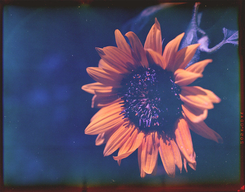
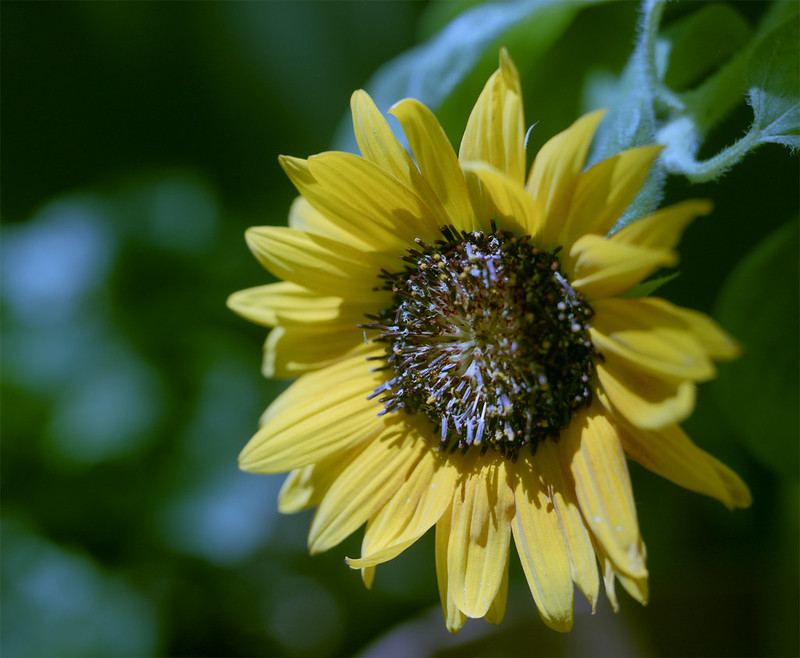
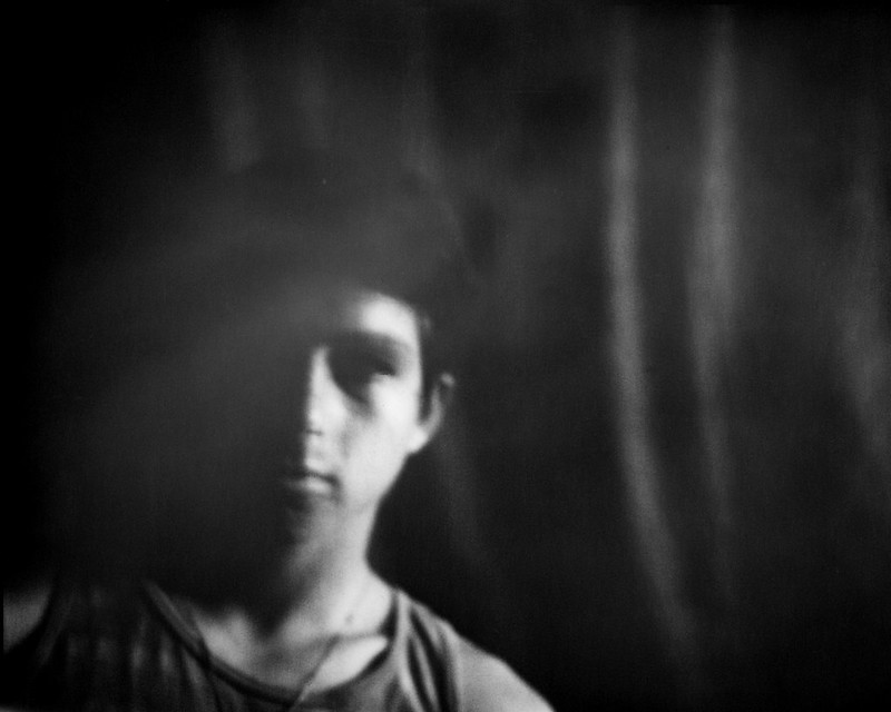
I took a couple shots of the same thing out in the garden, one without a filter and one with the 85B. Then I developed them normally in C-41 chemistry and scanned them, only adjusting for contrast. Then I took them into Photoshop and corrected each of the RGB histograms, adjusting them each to full scale. Then I masked off the left half to see what the image looked like out of the camera compared to what it looked like corrected in PS.

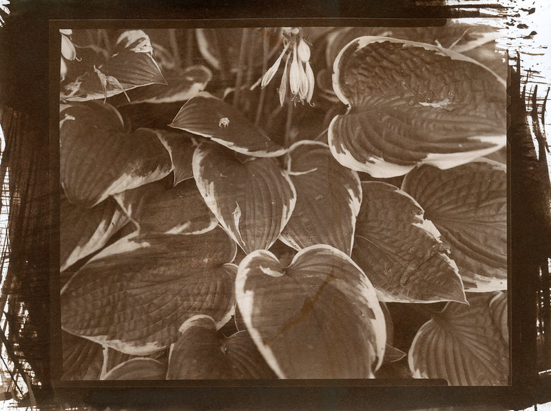
First the unfiltered shot:

unfiltered

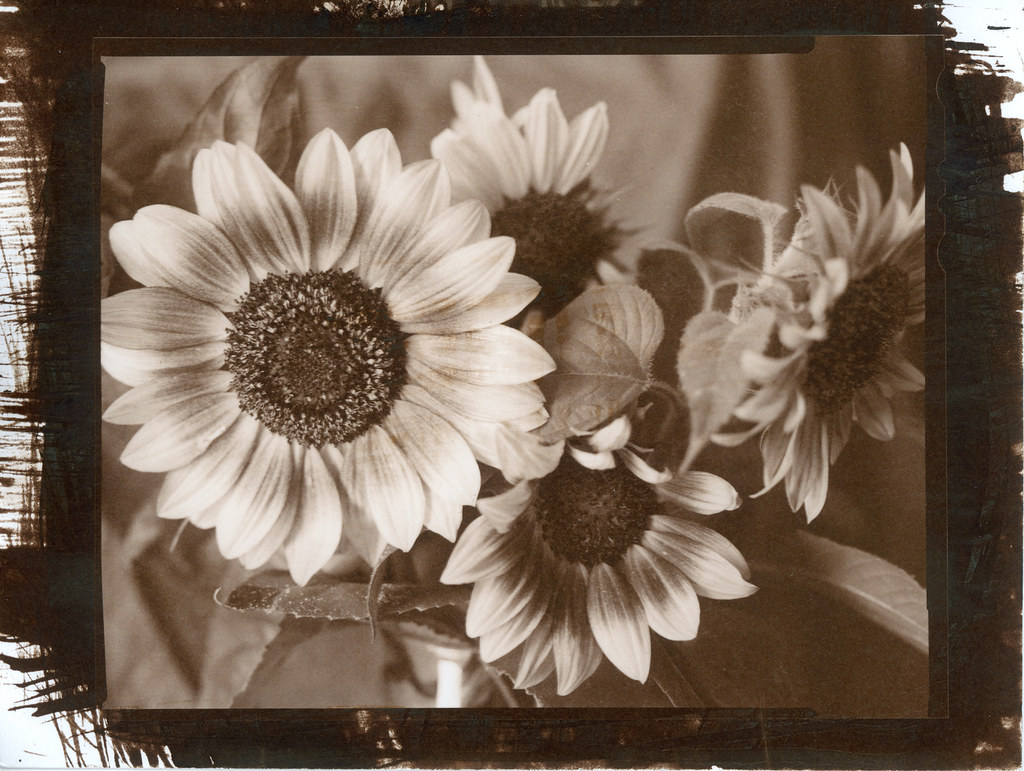
And the one with the 85B:

85B filtered

Looking at the left half of each shot, you can see a clear difference made by the filter. On the right side that has been further corrected in PS, the shadows are still sort of blue/green on the uncorrected shot. I could probably work that out with some more time and effort on the computer, but the point of being careful and intentional with analog photography is so that I don't have to spend my life on the computer. I want to make nice photos in my camera and on the negative. Sometimes that means putting a filter on the front of my lens to get the colors looking the way I want them.

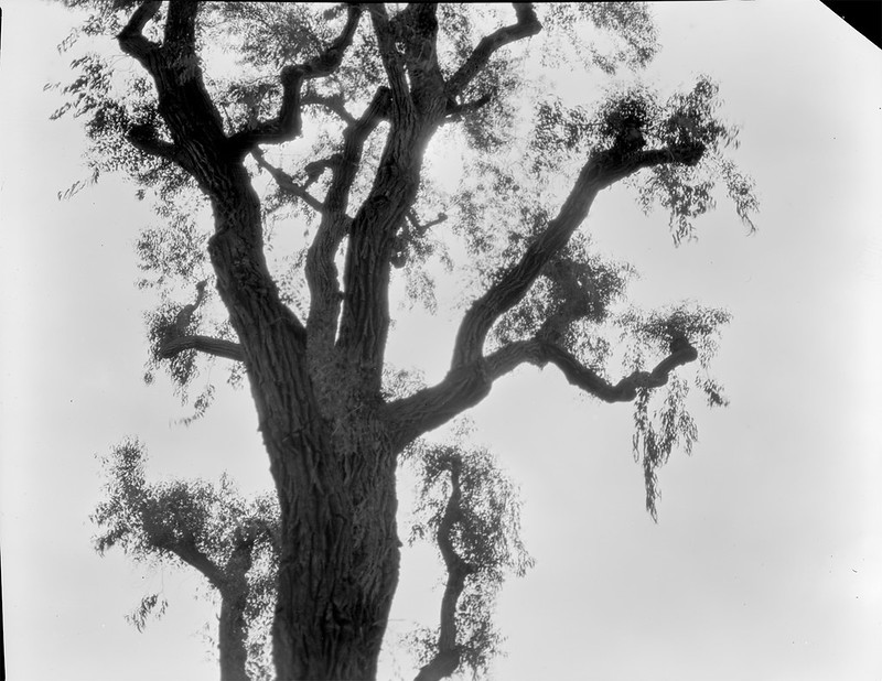
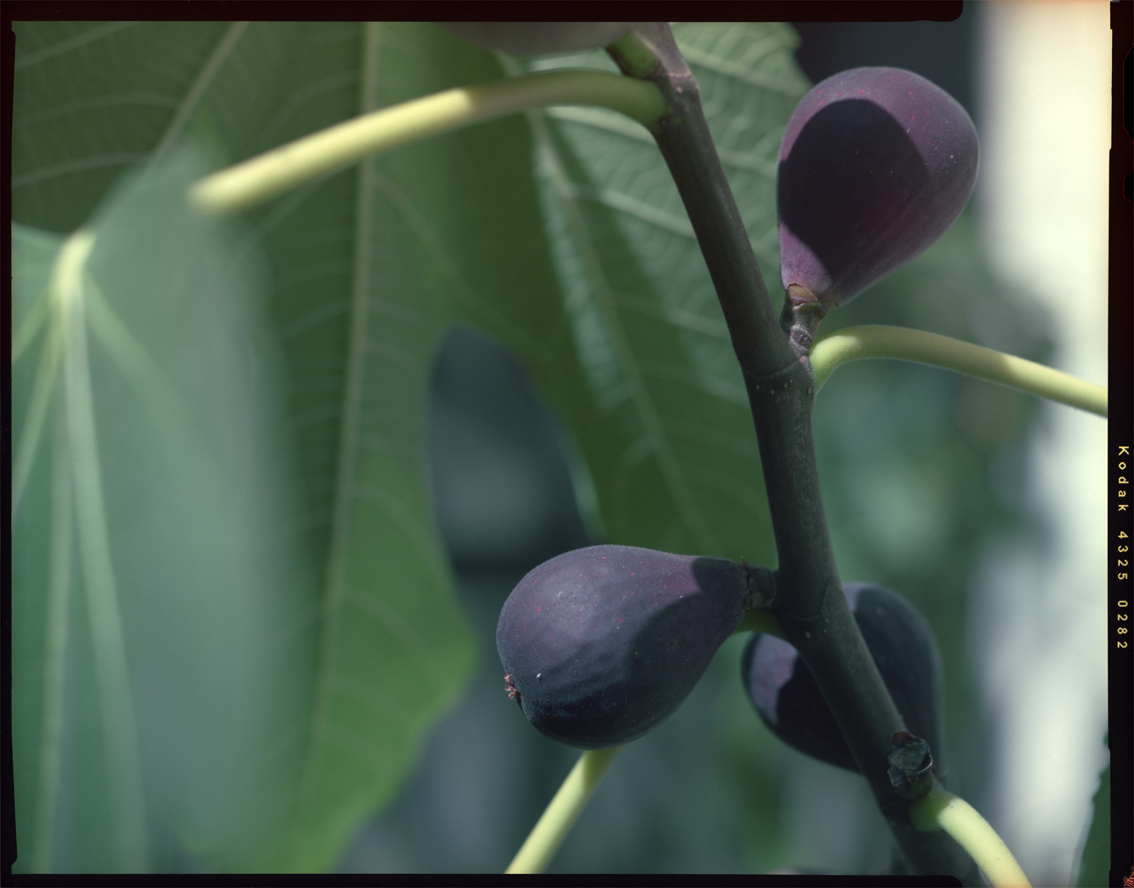
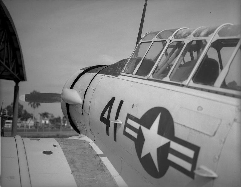
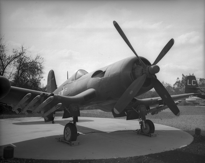
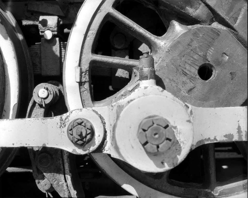
Finally, here is a shot out in the broad daylight, also shot through the 85B. This one is a little more colorful and interesting. It is your reward for reading through my article, so enjoy!

Squash flowers

Wednesday, July 19, 2017

Lumen-osity

I have not been a fan of the lumen print. Let's just get that out there. If you are, then keep reading (spoiler alert: I am now). Recently, over on Filmwasters, there was a discussion of the 'Lumenbox' which is a box camera designed with lumen printing in mind. But I'm getting ahead of myself. What is a lumen print? For that matter what is a lumen??

lu•men


/'lōōmən/
noun physics
the SI unit of luminous flux, equal to the amount of light emitted per second in a unit solid angle of one steradian from a uniform source of one candela.

I'll wait while you go look up "steradian"... Now that that's out of the way, lumen printing is simply the process of using regular black and white photo printing paper as a print out paper (POP) medium. That means you get a negative without using any chemical developer. Now in this case that may not be strictly true, but we'll get to that in a minute. So why the turn around on lumen prints James?? Well, I have really only ever seen contact prints of leaves and flowers done as lumen prints. I have nothing against leaves and flowers, but the lumen contact prints just didn't appeal to me. I don't have a good reason, it's just "because". Back to the Lumenbox camera. This guy put a simple meniscus (single element) lens on the front of a box and put a piece of photo paper in the back. He did this all in daylight, knowing that the paper, without being developed, is not very light-sensitive. He pointed his camera at something stationary for 15 minutes and pulled out a photo! Now I was a little intrigued, but not enough to buy one of his cameras... just interested. Then on Filmwasters, the people were discussing the camera and lumen printing in general and who else but Joe Van Cleave posted a couple of videos (vid 1 and vid 2) about some experiments he did with this method and his own little box camera. That really piqued my interest, especially the idea of integral developer (developer embedded in the emulsion of the paper). He and the Lumenbox guy both took the image using wet paper. The idea there was to wet the paper first and then expose it and the water will allow the integral developer do its thing while the exposure is taking place. To me that seemed overly complicated and potentially messy, especially as in vid 2, Joe puts a wetted paper into his Speed Graphic. That's a risk I'm not willing to take. So I thought if the developer is there, then there's no real reason it has to be 'activated' during the exposure. The light is doing its thing to the silver halides and the developer can wait, just like with any expose/develop process. The integral developer is intended to speed up processing, not raise the effective ISO. So it shouldn't matter when you wet the paper and activate the developer. So my thought was to expose the paper dry, then dunk it in some water to let the developer do its thing. So that's what I did. I cut a piece of paper down to 4x5 and put it in a film holder and put that in my Speed Graphic. Then I set the aperture wide open to f/4.7 and put the shutter on 'T'. Then I pointed it at a ponytail palm on my patio that sits against a white wall and left it there for 20 minutes.

I scanned and inverted the dry paper right out of the camera and got this:

That's not bad! It's a little blue, but if you don't like that it could be desaturated:

So then I thought I would try some alkaline water to really get that developer kicked in the acid! I put a pinch of washing soda (pH 11!) in some water and dunked the paper. I could immediately see things starting to happen... Bad things!! There were blobs and streaks and uneven shading and, well you get the point. The integral developer had either already reacted with something else, or was breaking down in some unpredictable way. But this was the result.

At this point the negative is destroyed, but I figured it was worth one more experiment, so I put it into some paper strength fixer (Ilford Rapid Fix 1:9). I will save myself the time of uploading it and just say it didn't help. It might have lowered the contrast a bit, but the blobs and streaks were still there.

So there you go. Lumen printing in a large format camera. I suppose you could try doing optical prints from the negative produced, but it probably wouldn't work. The negative isn't dense enough to really block any light and the light of an enlarger would probably fog the negative during the process. But don't let me discourage you if you are an experimenter. My idea here was to expose dry and then get it wet to 'develop', but what I learned was that there really isn't any need to have any aqueous involvement at all. The dry lumen print stands on its own. I hope this is informative for someone. If you see some glaring error in my logic or process, please leave a comment and we can all learn together.

Sunday, June 4, 2017

Gone Microfiche-ing

Using expired film can be a bit of a challenge. There is usually some loss in speed, so the apparent iso (or the effective EI, if you like) is lower and it is up to you as the film adventurer to determine by how much. The rule of thumb says one stop for each decade past its expiration date. So assuming you know the expiration date and didn't just come across a random roll of film, you can use that as a starting point. Keep in mind though that 'fast' films (to me that means iso 100 and higher) will lose speed 'faster' than slow films. So if you have a roll of Ektar 25 that expired in 1997, that's 20 years (two stops lost), but since it was slow film to begin with, it probably didn't lose a full two stops. Maybe 1½ or 1 stop would be a better starting point. "So what's your point here Jimbo?", you may be asking. First, I don't really like "Jimbo", people called me "Jim" in college, but generally, it's just "James" and has been since Mr. Salyers' 4th grade class. Secondly, I'm getting there!

Periodically, I search for Kodak Dacomatic Recordak film to buy. I have some in the fridge and I really like it. So I just keep an eye out for a spool. I never find any. But then one day the search popped a result on the big auction site. It was "Recordak", but didn't say "Dacomatic". Additionally, it was 500 ft of 105 mm stock! Well, that seemed odd, so I did some more digging on the specific emulsion number (4462) and it turned out to be a completely different film (seems obvious now). This one was used for microfiche production. So it was copy film like the Dacomatic, but a different type. The price was right, so I went and bought it, hoping against hope that I could get pictures from it. It originally (expired 12/1979) was rated at iso 2.1! So, figuring that this stuff is really not very sensitive to light to begin with, I figured it probably hasn't lost that much speed even in almost 40 years, but I'll give it a stop anyway. That puts it right about iso 1. Okay, so I have an exposure starting point. How am I going to develop this stuff? It was designed with an automated proprietary development scheme in mind, so all I could find in the VERY sparse documentation was "Microfilm DEVELOPER and Replenisher". That's it. So I figured I would hit up the old stand by, Rodinal 1:100 and do a strip test to see if it would even change color. In fact it did! In about 15 seconds, it was fully developed!! So much for 60 minutes of stand development. Well, I cut a few sheets and took some of what I am certain were the best photos of my entire life and dunked them in what I had on hand, which was some homemade Parodinal 1:100 for 4 minutes. That is what I use for x-ray film and it works just fine. This microfilm however, was completely dark. Hmm... Maybe I over-exposed it? I tried again, taking more absolutely stunning photos at higher and higher speeds. Again, completely dark. So over-exposure was not the problem. It must be over-development. I cut the time in half. Still totally dark. I mean just a dark sheet of film... No image whatsoever. The strip test I did showed that the film cleared completely in the fixer, so it wasn't that the fixer was bad or the film was totally fogged.

I was just about to give up and call it a total loss, but I thought I would just try a different developer for grins. Rodinal variants have always developed anything I threw at them, including a roll of Ansco Plenachrome expired in 1949. But desperate times, you know. I had some X-tol powder laying about and that is a phenidone based developer, so I figured one last try. And this time, I would take a high contrast shot with lots of bright San Diego sky AND I would develop under red safelight by inspection. Did I mention that this film is orthochromatic? No? Well, now I have.

BAM!!!

Recordak-iso-1

I got an image! That was in X-tol 1:3 for 10 minutes. Now to see if I could get something with a few more grays in there. So I took a shot in the shade. I gave it a little more exposure because I had the bellows extended a bit, but I forgot about the reciprocity failure that was mentioned in the tech doc. The negative was very thin, but still there was a photo and it had much more scale to it. It is still quite fine grained and in 4x5 sheets that means some super fine detail can be had.

Retro Eveready Photo Cells

Now I've got about 490 feet left of this to see what I can do with this flavor of copy film. I'm looking forward to making some photos with this oddball microfilm.

Tuesday, December 13, 2016

Strange New Development

I am unafraid of getting chemicals on my hands (figuratively) and mixing up concoctions. I have spent my share of time in the lab and have even blown a couple of things up, so mixing up photochemistry is not a problem. Additionally, I am comfortable with a certain amount of uncertainty in my photographic outcomes. I don't shoot weddings anymore, so no world is going to end if I totally screw up what I am doing. So when I recently became aware that X-tol and Rodinal could be mixed and that the results might encapsulate the best of both of those developers, I was on it. I had some X-tol powder that I weigh into 1L portions and I had some Parodinal, so I figured I would shoot some 4x5 Kodak CSG and some Arista Ortho Litho and see what came out of it. Normally, I would develop CSG shot at iso 80 in parodinal diluted 1:100 for 4.5 minutes, so I used that as a starting point and at the last minute decided to cut it in half. I shot the Arista at iso 3, but I haven't worked much with this film, so I don't have a standard development for it. My standard dilution for X-tol is 1+3. So 250 mL of X-tol, 5 mL of parodinal and top off to 1L. Nothing exploded, so I figured I was good to go. I chose 5 minutes with 4 inversions every minute. The temp was probably around 68F. Stop was with tap water, changed 4 times. Fix was 2 minutes in Ilford Rapid Fix. Both of these films have extremely thin emulsion layers and actually fix in about 15 seconds.

The Ortho Litho turned out with VERY high contrast as might be expected. Here are a couple of the shots.

SpeedGraphic-AristaOL-pan01
SpeedGraphic-AristaOL-pan03

The CSG was much more tame and the negs looked 'normal' as far as exposure and density goes. I think the grain might be a bit smoother with this X-tol based developer. Hard to say without some sort of side by side with the same exposure of the same subject, but my gut says it is smoother. I know, not very scientific, but this is my hobby not my job. I don't have to be quantitative if I don't want to.

SpeedGraphic-KodakCSG-pan01 SpeedGraphic-KodakCSG-pan02

Sunday, October 9, 2016

Apples and Oranges... and a Sunflower

I have wanted to write a little comparison article about these two films I have for a while, but you know... life... I finally got around to developing some sheets I had exposed months ago and I was happy to see that I had taken the same photo with each of these films. So, let's get to it.
First, let's get the variables out of the way. Both are 4x5 sheets taken within minutes of each other with my trusty Graflex Speed Graphic with the nice Graflex Optar 135/4.7 lens mounted. This was in early summer in the full mid-day sun. Film #1 is Kodak Vericolor II expired in 1997. This film is tungsten balanced, so shooting it in sunlight gives a blue cast. This can be corrected either by putting an 85 color correction (warming) filter on the lens or applying it in post. I do the latter. The problem with this particular box of film is that I don't think it was stored well and the base is fogged. Also, the edges drop off suddenly. I think the original box speed was around 80, but I shoot it at iso 25 to try compensating for the base fog. However, with all of these flaws, it can make some interesting and dramatic photos. Please excuse the dust on this, I hadn't really planned to share this, so I didn't dust spot.
Graflex_Vericolor2_1
You can obviously see the blue shadows and the high contrast. I could let the shadows drop out, but then I would just have some orange flower petals floating in space. I would rather let the film's character shine through and appreciate the uniqueness.
Next is Kodak Internegative Film. This was intended to make a positive duplicate from a negative which would then be used to make more negatives. Alternately, it could be used to make negatives from slides which would then be used to make prints. So it wasn't really intended to be a 'pictorial' film used in the camera. It was meant to be used in a commercial enlarger. With that in mind, I am shocked at the quality of this film. I don't think there was a set iso. The technician would have to test and adjust exposure depending on the original and any filtration they were using in the enlarger. I shot this at iso 5.
Graflex_Internegative_3
The colors are beautiful and the grain is nice and smooth. As I discovered when I scanned these and as I said in the title, these two films are not 'comparable'. So in that respect this little experiment failed. But that is not to say I didn't learn something. I found that the internegative film will produce nice smooth, accurate photos at iso 5. With a moderate scan resolution, this makes a 90 megapixel image that can be enlarged to any size you like. On the other hand, the Vericolor II makes a more unconventional/challenging image that brings a layer of abstraction to the subject. This definitely has its place in most film photographers' repertoire.
Here is another example of each film just for good measure. Enjoy.

Monday, September 14, 2015

My First Salt Print

I like making prints. Having something to hold in my hand at the end of the day is just more satisfying than looking at the inverted image of my scanned negative. The image on the screen is enough to keep me going with the whole photography thing, don't get me wrong, but there is something special about holding that paper with the image I created on it. Alas, I don't have a darkroom or an enlarger. I don't currently have the space to set it up, so it just isn't an option. Enter "contact printing"! Taaa Daaaaa! Contact printing is where you put your negative (or in some cases positive) in contact with a piece of paper that has been coated with light sensitive chemicals. This creates an inverted image on the paper... a print. This is very different than making an 'enlargement' from a negative. That involves projecting light through the negative onto photographic paper. The paper is then developed, washed, fixed and washed again. With most contact printing processes, there is no development step. It is called POP or Print Out Paper, which means that the image emerges during exposure. There is a literal ton of information on these interwebz about how to do this, so I won't rehash the history or list all of the different variations and recipes. I will just go briefly over the process I used for this, my first foray into silver-based printing.

The salt solution is:

  • 20g sea salt
  • 20g sodium citrate
  • enough purified water to make 1L

I brushed this solution onto Strathmore Bostick 100 lb hot press watercolor paper and let it dry. I chose this paper because it was lightweight (recommended) and smooth, so it wouldn't require an additional step of sizing to keep the chemicals on the surface. You don't want thick spongy paper that will absorb the chemicals or your prints will look 'soft', or not quite as sharp as the negative image you are using.

Next, I made this solution:

  • 12g Silver Nitrate
  • enough purified water to make 50mL

And this solution:
  • 6g citric acid
  • enough purified water to make 50mL

I made these two in amber dropper bottles with clear labeling. Silver nitrate is not to be trifled with. It will cause blindness if you get it in your eye, so absolutely wear eye protection when handling powder or solutions!! It will stain anything it gets on so cover counters and wear an apron and some sort of latex or nitrile gloves if you don't want black dots on your skin and clothes.

When you are ready to make a print, go to a dimly lit room (I use a room with a window, but keep the curtains drawn) and combine 1:1 the silver and citric acid solutions. I just eyeball it with the glass droppers. There isn't going to be any noticeable difference if you are 10% off one way or the other. I then use a brush to apply a thin coating of the solution to the dry salted paper. At this point a replacement reaction occurs and NaCl combines with AgNO3 to make the inert product NaNO3 and the light sensitive product AgCl. Let the paper dry, or use a cool hair dryer to get it nice and dry. I had good luck adding another coat when using a brush. The first print I did only had a single coat and there were visible brush marks in the image area.

Salt-Print--002

But I'm getting ahead of myself. I happen to have a nice printing frame that my lovely, beautiful, kind, generous and supportive wife (are you reading this darling?) gave me as a gift. If you don't have one (the printing frame, not the amazing wife), a piece of glass or two will do. As long as you can sandwich the negative between the glass and the sensitized paper, you will be fine. I made sure that the silver emulsion on the negative was pressed against the silver coating on the paper. That will give you the sharpest possible image. Then I set the whole thing out in the blazing San Diego sun for about 6.5 minutes. My printing frame has a split back that allows me to check the progress as I go, so there really isn't much guessing and I got a well exposed print on my first try. That's the one of the hostas just above this paragraph.

The print looks sort of orange/brown right out of the frame. Take a quick look in that dim room, but don't dilly dally. Start rinsing the print either under gently running water or in a water bath, agitating and changing the water frequently. "What do you mean by 'frequently'", you ask. Well, it gets a bit fuzzy here. People who live where there is more water than you know what to do with, can just let the water run and run for 10 to 20 minutes. But I live in drought-ridden So. California where the water police are watching and just waiting to double your water charges if your usage increases over last year. So I am probably under-washing my prints and they will only last 50 years instead of the 400 years that the museum archivists like. Since my prints will never darken the walls of a museum, I don't care. So I rinse under running water for a minute or two and then let the print sit in an appropriately sized tub with a couple of inches of water in it for 5 minutes and change the water 3 or 4 times. I figure that has got to provide at least a 1:1000 dilution of the unexposed AgCl left on the paper. If that isn't enough, then I apologize to the future generations of people with bad taste who might have appreciated my prints, but can't because they are too dark.

Next I fixed the print using this solution:

  • 100g Sodium Thiosulfate
  • enough purified water to make 1L

I just pour enough in the washing tub to cover the print, maybe 1/2 inch deep and let it soak with some gentle agitation for about 5-6 minutes. Then rinse again with the same scheme as before. When that is done, hang it to dry and bingo... salt print deliciousness!

Salt-Print--001

Tuesday, June 2, 2015

Adventures in Positive Paper

I may have mis-titled this post since the adventure was not really anything to do with the medium. I will just make a couple of technical notes. The paper was exposed in my Graflex Speed Graphic with the Graflex Optar 135mm f/4.7 lens. It was exposed using an EI (exposure index = iso) of 3. The light was indirect sun from a window, so not very bright and somewhat diffuse. Exposure time was ~ 60s at f/4.7. Tray development was done in Rodinal 1:50 by inspection under red light. I think it was around 10 minutes with fixation in Ilford Rapid Fix (1:4). The 'tray' I used was narrower than the paper, so I had to curl it into a 'U' shape and that may have had an effect on development as agitation was uneven.

Okay, the main thing I wanted to talk about was this. I don't take many people pictures. Look around my Flickr feed and you will see lots of plants and random objects and some landscape. Street photography is pretty much absent from my repertoire, and portraits are uncommon if not rare. Let's just get this out of the way. I am an introvert. I don't naturally connect with people, especially people I don't know well. So going up to people and asking them if I can take their photo is an experience on a level with unanesthetized fingernail extraction. I tried to work this out by starting a "100 Strangers" project. I think I made it to #3. Even though the people I photographed were friendly and good-natured, the negative reinforcement outweighed the positive.

That's probably more than you care to know about my inner psychology, so what does all of that have to do with anything? Only this... My youngest son (not so young any more) is the model for a good portion of the portraits I take. He is always willing to sit down and have his photo taken. It might even qualify as "quality time" since he is just curious enough to ask a question or two about what I'm doing and I am willing to take the time out of what I'm doing to explain it. Maybe some day he will want to start taking photographs himself.

So what was I trying to do with these two photos? I wanted to try some 'non-conventional' portraits that were more implicit than explicit. I wanted to do something to add another layer of abstraction. A photo is inherently abstract since it reduces a 3D object to 2D. Using b/w media is another layer of abstraction since most of us see in color. Removing any accompanying environment or context is a type of abstraction. Then I figured that since I was using a long exposure and not in any way 'stabilizing' my subject, there would be some motion blur. I decided to enhance this by using the on-camera shutter release and then intentionally shaking the camera ever so slightly. The first shot was a close up of Artyom's face. This is even more abstract because it isn't immediately obvious what the subject is. Most of us certainly never see another person from quite this close of a perspective. I would characterize this as "expressionistic". It uses a very abstract representation of the subject to say something about them or maybe just to create a beautiful pattern. Artyom is a 'touchy-feely' kind of person. He likes to get up close to people he likes. This photo illustrates that characteristic without explicitly showing him hugging someone. It is an 'expression' of that trait the way I see and feel it in my heart and mind.

Artyom abstract

The next shot is a little farther back, so that the subject is more recognizable. The high contrast of the photo depicts him in a certain way, but it does depict him. Anyone who knows him would recognize him in this photo. Artyom is very athletic and strong. This photo is very structural. It shows a stark outline of his shoulder, neck and collar bone. His gaze penetrates out of the photo at the viewer. So this image is what I would call "impressionist". It is an image of Artyom overlaid with the impression of his strength. The purpose of the image is not to identify him, but to identify with him. Please take a moment to comment if you like anything about these photos. I appreciate your feedback.

Artyom

Monday, December 15, 2014

The Flying Leatherneck Aviation Museum

Ever since I was a little kid, I loved airplanes. The thought of flying was the most thrilling thing I could think of. In 1976 when I was 9, a show came on TV called Baa Baa Black Sheep. It was about Marine Attack Squadron 214, AKA The Black Sheep Squadron. This was a squadron of 8 F4U Corsairs, which immediately became my favorite fighter. I guess it still is. I love the look of the plane. The inverted gull wings and the enormous engine make it so unique and in fact proved to be a formidable fighting machine, serving from 1942 - 1953. But I really just like planes in general, so when I get the chance, I drive a couple of miles over to MCAS Miramar where the Flying Leatherneck Aviation Museum is. Last week I went over and took my 50's vintage Graflex Speed Graphic with a Graflex Optar 135mm f/4.7 lens and some sheets of Ilford Delta 100 film. The day was cloudy, so exposures were a little tough. Working with a large format camera means you are taking time to do everything and double checking it all before you trip the shutter. On days when clouds are covering and uncovering the sun every 30-60 seconds, that's a problem. So I just took an average reading and figured I would stand develop the film and that would correct for overs and unders. So here are the pics from my day at the Flying Leatherneck Museum.

Leatherneck 7 Leatherneck-8 Leatherneck-9 Leatherneck-4 Leatherneck-2 Leatherneck-5

Monday, October 6, 2014

Flash Bulb Magic

I shot a wedding last weekend for two dear friends. The days before the wedding were fraught with the anxiety of shooting a wedding and what gear to take. The DSLR went with a short prime telephoto and the bride lent me her better-than-mine DSLR with a medium telephoto. So that covered the "safe" option. I would get all of the photos that I "expect" from myself when shooting a wedding. Now... what to take to get the photos that I "desire"? 35mm format is covered by the digicams, so I left the 35mm film cameras at home. If I was going to carry the weight, I should make it count. Medium format: Yashica Mat 124G (I only took 2 or 3 with that) and Brownie Hawkeye Flash Model (I think I only took one with that). The sanctuary was pretty dim, so the film I generally shoot with was too slow for moving subjects. You think that people getting married are just up front standing still, but they aren't. They are fidgeting and looking at each other and then at the pastor and then they go light candles, etc etc. After the ceremony, I did all of the formal family & friends photos, again mostly digital, but I did keep one surprise in reserve. The Graflex Speed Graphic! I brought this monster out to the enthusiastic "oooh's" and "aaaaah's" of the expectant crowd (okay, that may be a bit hyperbolic). Pose; meter; focus; aperture; focus; meter; aperture; dark slide out; cock shutter; focus; "One-Two-Three---CLICK"; dark slide in.

Portrait1

If Kodak Tri-X 320 was a food, it would be butter. I developed this in Adox Adonal 1:100 for 70min with agitation at 0 and 35min. You might think I did a lot of correcting in post after scanning, but you would be wrong... dead wrong. Now get your things and get off of my blog! Just kidding. You should stay for the rest. It's going to get good. I promise.

I took another just like that one for safety (good thing too). Then it was off to the reception. It was a small room in an Italian restaurant in La Jolla, CA. I did what I could with the DSLR, but the flash was just making me cranky. I had it dialed down to -2.0, with a cup diffuser, bouncing off the walls and ceiling. Everything short of a soft box to get some light but minimize the shadows. They turned out okay, but I am so used to film, the digital rendering of the scene was just missing something. Out comes the Speed Graphic, along with the flash and 7-inch reflector. I loaded up with Tri-X again and popped in a GE #5 bulb. I had done the calculation the day before. Iso 320, Guide Number at 1/100 sec is 300, that makes if f/30 for a subject 10 feet away. I decided to open it half a stop and hoped that the highlights wouldn't get blasted. Expose for the shadows, develop for the highlights, right? Now there's something about flashbulbs. First, the 7-inch reflector is mirror polished and makes a BIG cone of light that is hot in the middle and falls off at the edges. Also, it flashes over time. It seems instantaneous, but over the life of the bulg, it is starting out dim and soft, then ramping up to full power, then falling off. Depending on where in that cycle the shutter opens, there will be a dramatic difference in the look of your photo. Generally though, the light is on the soft side (for a direct flash) and hot in the middle. The shadows are there, but they aren't the harsh outlines you are used to seeing. So take a look at these two photos I shot at night in a very dim restaurant and tell me there isn't something magic about this flash and camera.

Reception1

Reception2

Thursday, July 24, 2014

Pacific Southwest Railway Museum

A couple of weekends ago, my family packed up for an outing. We live in San Diego which is pretty hot in the summer, but with two boys in school, we don't have a lot of options for getting out of town. The youngest wanted to go 'camping', but here in So. Cal. the camp sites have to be reserved and they get filled up about 6 months in advance. So there we were without a reservation, wondering where we could go. So with a little searching, we found a small lake down near the border and out east about an hour away. It was going to be hot there too, but at least we could get away from work and 'routine'. One of the up-sides of this location was that it was near Campo, CA and in Campo is the Pacific Southwest Railway Museum. I figured that there would be ample photo opportunities there, so I brought my large format (4x5) Speed Graphic and 6 sheets of Kodak CSG x-ray film. Taking only a limited number of sheets forces me to slow down and consider my shots more carefully. So here are the three best shots from that day.


I have to say that I was pleasantly surprised at the museum. I am not an 'old train guy'. I am an 'old camera guy', but the two are oddly akin. They are machines of a bygone era that hold a fascination for those who still use them. They are more mechanical than electronic, with gears and springs and levers doing the precision work of taking photos or moving people and cargo. The Pacific Southwest Railway is definitely worth a visit. The 12 mile train ride through the rugged California back country is wonderful for all ages. The display house has some great engines and restored cars that you can get right into and feel like you have stepped back in time.

I hope you take a trip down to Campo and see the Pacific Southwest Railway Museum. It is worth the drive and if you bring along your camera, you will be rewarded with lots of great photos.

Saturday, June 21, 2014

Toning Cyanotypes

I've discussed this topic before, but this morning I was doing some experimenting and thought I would share some insights.

First, I started off with a 4x5 Tri-X negative from my Speed Graphic. I scanned it and inverted it to a positive. Then I made a few adjustments and removed any dust spots. That image looks like this.

Nice, huh? I thought so. I needed some prints of this, but rather than sending the negative to a custom darkroom (expensive) or having it digitally printed on a nice ink printer (not the quality/look I want), I thought I would make some cyanotype contact prints right here at home. Of course, I could print using the original negative, but I can only print one at a time and the exposure times are quite long, even in bright sun (around 20min or so). So I decided to re-invert the scan and print it on regular printer paper, then make waxed paper negatives of the image duplicated. Like this.

Then I coated some Canson Aquarelle 140# Cold Press watercolor paper with the traditional 2-part cyanotype formula. UV light penetrates the waxed paper much better than it does the plastic film base of photographic film, so the exposures worked out to be about 4 min. Unfortunately, I over-estimated the time needed and started with 12min, then tried 10min and 8min before I settled on the 4min exposure. So now I had six prints that were quite over-exposed. I could just toss them, but that goes against my frugal nature. I decided I would see if bleaching and toning would recover some contrast. Bleaching is done with dilute washing soda (sodium carbonate). On my first attempt, I had the solution WAY too strong (~1/2Tbs in 2c water) and it completely bleached the print almost immediately. In this picture you can see the over-exposed, unbleached print next to the one I just bleached.

At that point, I diluted the washing soda about 100x and that was much more manageable. Next is the toning step. For this, I use wine tannin. I put about 1/2tsp in 2c water. Some people put these solutions in trays and dip the prints, but I like to just brush them on. It gives me a little more control, I think. So here is a picture of the same two prints. The second one was 'gently' bleached and then the tannin was applied to both.

The lower one isn't really coming back, so that is probably just a loss. This is how we learn. :) I continued on with this method of bleach for a minute or so, followed by a rinse followed by toning until it 'looked right' and I must say that the over-exposed prints actually look pretty good with improved contrast and a little interesting color. It's almost like a split-tone which is a look I like. Here are a couple of the 'correctly exposed' prints after toning.

This is tons of fun and really cheap. I plan to send these off to friends as postcards which is even more fun. I hope this is informative. Put a link to your toned cyanotype in the comments. I'd love to see them!


Addendum:
I decided to make a print out of the 'other side' of the postcard, so I did a quick something in Photoshop, printed it, waxed it and cyanotyped it. I think it looks pretty good and completes the package in an artistically coherent way.

Tuesday, April 22, 2014

Springtime in San Diego

Here in San Diego, California we have two seasons. There is Warm Summer and Hot Summer. Right now we are still in Warm Summer as it is late April and Hot Summer doesn't really get here until late July. But I know that Hot Summer is coming because the Coral Trees are in bloom.

I took this photo with my Graflex Speed Graphic using the Optar 135, F/4.7 lens. I shot it on Kodak Clinic Select Green x-ray film and developed in 1:100 Adonal for 4.5 min standing. I hope you are enjoying the change of seasons where you are.

Friday, November 29, 2013

New Found Respect

I photographed a wedding recently. I was torn over which camera(s) to bring with me. Of course the Nikon D7000 with a variety of lenses and flash were the base that most of the photos would be taken with. It is just foolish to not bring digital to a wedding these days. I will tell you though that the inevitable happened and I only kept about 30% of the images I took. It is the digital demon that causes people to just snap away without enough thought that inhabited me. I am not ashamed because I ended up with a few hundred shots that I am proud to give the happy couple whereas if I had been shooting only film, they would have had a fraction of that. I took two film cameras to the wedding. First was my '39 Voigtländer Bessa 6x9. The other was my Graflex Speed Graphic with the Graflex Optar 135mm f/4,7 lens and six sheets each of Portra 400 and Kodak CSG x-ray film. This is commonly called a "press camera" because back in the day, it was a camera used by many newspaper photographers. These guys would carry these cameras around with the flash unit attached and pockets full of film holders and flashbulbs. The flashbulbs are somewhat prone to igniting from a little static discharge, so caution must be taken when carrying them in the pocket of wool pants, especially in the winter. Many photographers suffered burns on their thighs from accidental ignitions. I didn't put any bulbs in my pockets, but I did attach the flash unit and brought along some clear GE #5 and blue #5B flashbulbs. The camera weighs in at about 6.6lb with the flash adding another 2.4lb. Add a film holder and you are getting close to 10 pounds. That is not bad to lift up and take one or two shots, but those old timers lugged that rig around for hours maybe, depending on the event they were covering. So respect to those guys who were beat reporters in the 30's, 40's and 50's. It may not have been high art, but it was hard work and low pay.

Here is one of the shots I took with the Speed Graphic using Portra 400 and a #5B blue flashbulb. The color balance came out perfect, which I didn't really expect. The scanner may have contributed, but it looks just like Portra should look. I might have missed the focus just a little, but since they are dancing, a little blur is non-fatal to the photo. I like the way the flashbulb and accompanying 7-inch reflector light the scene. It is definitely 'hotter' in the center and less so at the edges, causing a sort of natural vignetting.

I am happy that I could bring the old technology into service again. I am also happy that Kodak and others are still making film with the newest emulsions (yes, I miss some of the old ones). The photos we are able to create with this pairing are 'classic' in their own rights and have a look to them that is unmistakably film. Drop me some feedback if you like shooting film in old cameras.Wedding Dancing

Saturday, November 16, 2013

100 Strangers 2&3/100

A couple of weekends ago I was at the big weekly swap meet, what my UK counterparts might call a 'car boot sale'. I took my Graflex Speed Graphic just in case there was something to photograph while there. I figured with that many bargain hunters walking around, there would be some good opportunities for my 100 Strangers Project. Most of my time was spent looking for bargain basement prices on cameras in good condition. Well, I didn't really find any of those, but carrying around a Speed Graphic did make for some easy introductions to strangers.

This is Denny. He was selling some very cool barware. Mostly he had martini shaker/glass sets that were printed with various themes. I don't like martinis, so I didn't pay much attention to his wares, but from watching him work you would have thought he was selling used cars. I mean this guy could talk you out of your shirt and sell it right back to you. So when I walked by, he immediately commented on the camera. He wanted to know all about it and I was happy to talk with him. At the end of the conversation, I asked if I could take his photo. He agreed, but while I was metering and focusing, another mark entered his line of sight and he was off to close another sale.

Denny This guy also asked about my camera, but was really just interested in what I paid for it. I got a few questions like that from various people. I assume that this was a piece of information they wanted to tuck away in case they ever came across one to buy or sell. Anyway, this guy was sitting in this big old wicker chair talking about the good ol' days in the clubs when you would sit in a chair like this and have the ladies come sit on your lap. The funny part came when he would try to convince some young (or not so young) lady to come sit on his lap. The looks they gave him were priceless. And I think he was truly surprised and disappointed that they would not come and sit with him. I had to get a photo of this guy. The other guy was I think just a passer-by who wanted in the photo.

King-of-Kobeys

Wednesday, November 13, 2013

Dia de los Muertos

I was carrying my speed graphic around the BIG swap meet here in San Diego, looking for interesting things and people. I came across this boot selling decor for Dia de los Muertos. I snapped a shot on the Kodak x-ray film I had loaded, but I forgot to focus. I think it turns this photo from and interesting image of some small statuary into something a little creepier.

de-los-muertos

Here is another pic I took a little farther along at a flower vendor. The guy selling the flowers came out of his booth at me and said, "Five dollars a picture!" I laughed and walked away. The people selling at this swap meet are ferocious hagglers and want to gouge every last cent out of you. I thought I would find some nice little film cameras for good prices, but pretty much everything was double its market value. I don't like bickering over money, so I took a pass on buying anything there, but it was fun to walk around and take some "free" photos. I got a couple more for my 100 strangers project which I will post soon.

Flowers

Thursday, October 24, 2013

A Cyanotype Miracle

I believe that miracles really happen. In spite of the title, this is not one of them, but the word is apt in a figurative sense to describe the improbability of what happened with these two prints. Allow me to start at the beginning.

I went downtown to the art supply store here in San Diego. I wanted to buy a pad of hot press watercolor paper to make some cyanotypes with. Well, either they don't make hot press in pads, or this store doesn't carry them, or both. So I ended up getting a small pad of Strathmore 400 cold press. It just says "heavy weight", but feels like 140#. One sheet (5.5x8.5 in) is just the right size for 2 4x5 negatives. So I cut it in half and coated it up with my traditional cyanotype solutions which are a year or more old, but still kicking. I left it in the dark over night to dry. The next day, I put everything in my contact printing frame and set it out for a good 7 minutes. That seemed like an adequate amount of time because I am used to using waxed paper negatives which transmit UV light much better than the plastic used in film. Needless to say, when I washed the prints (in dilute white vinegar) there was not much of an image there. The borders were dark, but the image area was very faint. I probably needed around 20 minutes. I set them aside until I could decide what to do. It was too bad I didn't have color separated negs for these photos, because this would be a great start for a tri-color gum print. But I just had the one negative for each image.

So I decided after they were dry, I would re-coat with the cyanotype solution, register the negatives over the existing image and try to print them again. This is where the miracles start happening. Usually, watercolor paper will shrink if you soak it in water then dry it. This paper didn't, at least not noticeably. In fact the negatives seemed to register perfectly over the previous image. I had to just register the edges since I couldn't really see any of the image through the negative. The next day it was completely overcast. I didn't even bother putting the printing frame outside. It was too dark by the time I got home. The next day, I knew I had to do something because the cyanotype was going to start fogging if I just left it unexposed in the printing frame. So when I saw the clouds start to clear at work, I called home and had my wonderful bride put the printing frame outside. It was still sort of cloudy, so I told her to leave it for an hour then bring it in. Then suddenly the clouds broke and the sun was out! We exchanged a couple of text messages and I figured the whole thing was a wash. There was no way to tell how much UV exposure it had, and I would just start over on the back sides of the prints. I came home and took a peek under one of the negatives and it wasn't completely dark, so I figured what the heck. I did the same vinegar wash as before and cleared it in fresh tap water. What came out was about the best cyanotypes I think I have ever made. The tonal scale is nice and long (for a cyanotype), the edges are clear, just the whole thing came out about as good as I could have wished. So through two printings of some unknowable exposure combined with sitting out for a couple of days in the air, I got a couple of beautiful prints. I can not explain how it happened, and I will never be able to reproduce the process. Anyway, here they are.

Artyom-Cyanotype

Water

Sunday, October 20, 2013

Diffraction

I generally stay away from the higher (smaller) apertures on most of my lenses. Why? Diffraction. This happens when the light has to pass through a small opening. It tends to scatter and your photos will be less sharp. It gets noticeable above say f/11 or so. Also , those small apertures cut the amount of light hitting your film, so unless you are shooting high speed film (or pushing your film higher than its 'box speed') the shutter speeds get long-ish. So when I walked out to the pool the other night I was planning on shooting my lens wide open even though my camera was mounted on a tripod. But when I got out there and saw the light and realized I was looking at a very high contrast scene that might be a little boring, I decided to close down the lens to f/32. I spot metered the water in the pool and came up with a 2 minute exposure time. I wasn't sure if the x-ray film I had loaded in the Speed Graphic would have the latitude to compensate for any reciprocity failure, but I decided just to shoot at the metered value and see what I got. The pool isn't going anywhere and I can re-shoot this scene any night of the week. What I was hoping for with that small aperture was to see some diffraction of the bright lights to give the composition a little 'umph'. Most lenses will also make stars out of points of light at small apertures because of the imperfection of the circle made by the aperture mechanism. I like how this photo came out. It looks pretty much the way I saw it in my head. It's not deeply meaningful or poignant, but kind of a cool night shot of something I see every day.

Night Pool

Monday, October 14, 2013

1/100 Strangers

So I decided to embark on the 100 Strangers Challenge. It is a pretty simple concept. Take a portrait of 100 strangers. That's it. Okay, it's a little more involved than that, but not much. The idea is to take portraits, not candids from 200ft away with a telephoto lens. It is designed to improve two things; your portrait photos and your ability to connect with your models. I am personally terrible at connecting with my subjects. I am on the far end of the introversion scale and striking up a conversation with a complete stranger has a very high threshold energy for me. Making a request is even harder. So I need to improve and that means practice.

I drive past a high school in my neighborhood almost every day. For the last month or more, I have noticed a school bus parked out on the street, presumably waiting for athletes or some other group that is at school late. Inside the bus, the driver is waiting, but not just waiting, practicing. He is playing a trumpet... every time I drive by. So I thought that this guy would be a good first subject. He was already inspiring me with his dedication to his art.

I pulled over and carried my Speed Graphic over to the open bus door and explained that I drove by each day and asked him what kind of music he was playing. We talked for a short time and I explained that I would like to take his photo. He agreed and said that he wanted to do it out on the grass. I thought it would be a great shot inside the bus, but he was clearly uncomfortable with that, so I didn't press it. Anyway, here it is. Unfortunately, I think I over-developed it, so it is quite grainy. I don't know, sometimes that grows on me. I will have to look at this one a few more times.

This is my first stranger.

100 Strangers 1/100 - Roberto

Sunday, September 29, 2013

Toned Cyanotype

I have been wanting to try this for a while and this weekend I finally had some time to read up and give it a go. I had bought some wine tannin a while back since tannin is the primary component in tea that is responsible for toning cyanotypes. With the powdered tannin I can skip the brewing step and be a little more quantitative/reproducible about the process. So what did I do?

The image I used was from a while back. It is a 4x5 negative on x-ray film. For details of that image, look here. The cyanotype sensitizer I used was the traditional formula (not the Ware formula) and I have to admit it has been sitting in my photo box for probably a year or more. That is a testimony to the longevity of those solutions and the archival quality of the prints. The paper is Arches 90# hot press watercolor paper (love that stuff). The exposure was 6 minutes (probably should have done 8) in the waning autumnal sun (5:00pm in San Diego). The first bath was about 1:4 white vinegar:tap water. That was intended to extend the tonal range and I think it worked pretty well. Look at the bellows on the camera and you can see quite a few grays in there. Also, the blacks are 'just black' and not too blocky. This might be lost on the computer monitor, but the print is quite nice. The highlights are blown because I under-exposed the print, but that can be remedied next time. Then I washed in lots of plain water until the highlights cleared and were the same color as the borders of the paper. I then did another quick bath in dilute hydrogen peroxide to fully develop the iron. This can be done by drying the print and just waiting a few days, but I am impatient. Another plain water wash and it was time to tone.

I mixed ½ tsp washing soda in 500mL of distilled water.
I mixed 1 tsp wine tannin in 500mL of distilled water.

Starting with the soda bath, I alternated soda... water... tannin... water... for about 30 sec each until it started looking the way and the color I thought I wanted. Here is what I ended up with.

Voigtlander toned cyanotype

Saturday, September 28, 2013

Blurry Self Portrait

I recently saw a post over on FilmWasters.com where the author/artist posted a whole roll of photos where he admittedly
... made quite a few mistakes with focusing and exposure.
I thought this was quite bold to post publicly some shots that are not one's very best. It makes you artistically vulnerable. Now, granted the FilmWasters community is warm and welcoming and humble; very unlikely to tear apart a fellow 'filmy'. But even at that, I thought it was a really good post. They were putting themselves out there in hopes that they could educate or inform someone. Now here is the 'weird' thing. I actually liked the photos! They were blurry, but still picturesque. They were taken on expired color film, so the color and contrast were shifted slightly which lent more to the painterly qualities.

So I am taking heart from this person and have decided to post a photo of mine that did not turn out the way I expected (or wanted). I was going to just bin it, but after thinking about it for a few days, I am posting it here.

Not Looking

I took this self portrait with my Speed Graphic. Of course there is no 'auto focus' so I had the task of figuring out how to focus on myself. The short answer is that without some elaborate setup with mirrors and magnifiers and perhaps some technology on load from the NSA, I can't. The best I could do was to focus on the back of the chair I was going to sit in and then turn the focus knob back just a bit. Then I stopped the lens down to f/8. This gave me a 1/5 sec exposure which is about as long as I thought I could reliably hold still. Then I loaded the film, attached a long cable release, sat down and tried to visualize where the plane of focus was. "CLICK" Now to the darkroom to see my masterpiece! WHAT!!?? Out of focus!! Well, I'll toss it and try again later. But not this time. I am going out on an artistic branch and posting this photo on Flickr and here. Let's see what the fates bring to this mistake.