Saturday, August 3, 2019

Controlling Weird Film

Sometimes I buy 'weird' film on a whim. I was recently noticing that my supply of 8x10 Kodak Clinic Select Green x-ray film was running low. I bought 100 sheets of it a few years ago and for the most part I cut it down to 4x5 sheets and shot it in my Graflex Speed Graphic. I had good luck developing it in various developers using the Mod-54 device. The emulsion is very thin and on both sides of the film, so it tends to get scratches where the Mod-54 holder grips it. But other than that I was happy with the results. So I went looking for some more. I found it, but not before I noticed a box of Kodak Camera 2000 film in 10x12 for sale. That's 6 sheets of 4x5 per sheet of 10x12, so that made it very cheap to shoot, but I knew nothing about this film. So the research began. Turns out that it is copy film for line art and half-tone images (like newspapers print with the grid of little black dots of varying size to create the illusion of grey scale). So it is a 'black-or-white' kind of film... very high contrast. The only example I could find of true pictorial use was from Mike Rasso on Flickr. Even then he had only posted a couple of shots. They were contrasty, but not terribly so. The catch was the iso. He had shot it at iso 0.8! Now that's some slow film. But if you have read many of my other posts, you will know that I'm not afraid of low speeds. You might say I'm a low speed junky. So that was it. I bought the box and set about reading the Kodak spec sheet in anticipation of taming this beast. It is ortho-chromatic. That is to say it has no sensitivity to red light. That's a bonus when it comes to cutting 10x12 sheets down to 4x5 since I can work under a safe light and don't have to operate the guillotine cutter in total darkness. The base is 'thin'. I read this, but didn't really realize what they meant by that. I have used thin base films in 35mm and it can be a bit of a hassle, but this was large sheet film. Certainly it wouldn't be THAT thin. But it is. It's really thin. That makes tank developing a little more tricky. You can't slosh it around or it will come out of the Mod-54 tracks and stick to other sheets and hilarity will ensue. The one thing I didn't anticipate was that it is not notched. So it's difficult to tell which side is the emulsion side. I took a sheet out into the light and looked at it. One side is shiny brown and the other side is shiny purple. Neither one gave an indication by visual inspection that it was emulsion. So I put a drop of developer on either side. Sure enough, the purple side turned deep brown and the brown side stayed brown, no change to speak of.
The next question was "Which developer will make the best negatives?" My go-to is Parodinal (DIY Rodinal), then My-tol (DIY X-Tol), but for this I thought I would try an off-the-shelf developer. So I bought my first bottle of HC110. This is a legendary developer for those who wade into the miry waters of long-expired film. It does a good job developing the exposed silver without bringing up the base fog. I thought I would give it a try on this odd-ball film to see if I could coax some length into the tonal range. So I tried a high dilution (Dil. J) which is 1:150. For the first go-round I thought I would do tray development under safe light since I had no idea how long I would need to develop this stuff. As it turns out it's still hard to see how far the development has progressed, so it's still largely a guess. My first try I shot at iso 6 (by accident) I pulled at 6 minutes. That seemed really short, but I could see an image and didn't want to over-develop (I'm scanning, not wet printing). Here's the result:
That looks pretty good off the scanner. If I zoom waaayyy in, there is no detail in the darkest shadows. In fact, you can see the weird 'plaid' pattern of the substrate. That means there is really no exposed silver there and it happens with thin negatives, but at 'sharable' resolutions, it looks fine. It is too thin to ever use for either contact printing or wet enlargement. IT's okay. I got an image with a full range of greys and little to no grain at all. I'll count that as a success.

The next shot was at iso 3 and developed for 8 minutes. The negative was still pretty thin. Here it is. You can see that the handle of the knife and the bowl of the pipe are a bit lighter and the highlights on the blade are a bit whiter. Overall there is more contrast, but it is still manageable. The negative is still too thin for printing, so maybe a little stronger developer is called for.

I have in the past added a little bit of Parodinal to dilute developers to give them a 'boost' and put some meat on otherwise bony negatives. So next I added the same amount of Parodinal as HC100 (1:150 of each, bringing the 'developer' dilution down to 1:75). I also bumped the iso down to 1.5. This negative is definitely lower in contrast, but not really more dense. You can also see the fog rolling in around the edges. This is heading in the wrong direction.

Finally, I shot one at iso 0.8 like Mike Rasso. It just exaggerated all of the problems with the previous one. There is definitely a LOT more experimenting to do with this film to get it where I want it. Good thing I have 600 sheets of it!!

Saturday, June 8, 2019

To 85B, Or Not to 85B...

I have a box of 4x5 Kodak 4325 Commercial Internegative Film that expired in 2004. I got it cheap, as I do most of the film I shoot. Internegative film was used to make a negative from a color corrected positive that would then be used to make positive copies for distribution. Normally you see this in the motion picture industry using 35mm stocks, but I suppose magazines and such could use the same process with sheet film. As you might imagine, this was not intended to be used 'in-camera'. It is copy film that would be used in a very controlled environment in a copy machine of some sort. It is tungsten balanced (again not for daylight use) and very fine grained. After all, if you went to all the trouble of making a good positive, you don't want to lose information by copying onto grainy internegative film. With very fine grain comes a very low ISO rating. I rate this film at about ISO 1. That is really slow. I could go as high as 5, but 1 is easier for me to remember. Why is 1 easier to remember than 5?? The human mind continues to be a mystery.

Being tungsten balanced means that colors look 'normal' when this is shot under tungsten (incandescent) light which is a warm yellow color. Out in the daylight which is a bright slightly blue/white, things look quite blue. The 'analog' solution to this is to use color correction filters. These are filters you put on the front of your lens to change the color of the light entering the camera from something like daylight to something like tungsten (orange filters), or vice versa (blue filters). Since I have tungsten balanced film that 'expects' yellowish light and I want to shoot out in the blueish sunlight, I need the orange filter known as 85B. There is an 85C also that is less intense for use later in the day when the light is already turning orange outside.

I took a couple shots of the same thing out in the garden, one without a filter and one with the 85B. Then I developed them normally in C-41 chemistry and scanned them, only adjusting for contrast. Then I took them into Photoshop and corrected each of the RGB histograms, adjusting them each to full scale. Then I masked off the left half to see what the image looked like out of the camera compared to what it looked like corrected in PS.

First the unfiltered shot:

unfiltered

And the one with the 85B:

85B filtered

Looking at the left half of each shot, you can see a clear difference made by the filter. On the right side that has been further corrected in PS, the shadows are still sort of blue/green on the uncorrected shot. I could probably work that out with some more time and effort on the computer, but the point of being careful and intentional with analog photography is so that I don't have to spend my life on the computer. I want to make nice photos in my camera and on the negative. Sometimes that means putting a filter on the front of my lens to get the colors looking the way I want them.

Finally, here is a shot out in the broad daylight, also shot through the 85B. This one is a little more colorful and interesting. It is your reward for reading through my article, so enjoy!

Squash flowers

Sunday, March 17, 2019

To Bleach Or Not To Bleach

Bleach bypass is a process that has intrigued me for a while. Recently, while listening to Matt Melcher's podcast Box of Cameras, he mentioned using this process in an upcoming project. I had tried this before and not really liked the results, but this prompted me to try again since he specifically mentioned Fujicolor film and I happen to have some of that in the fridge. It is Expired (2010) Fujicolor 100, and he is using Fujicolor 200, but I figured "How different could it really be?". It's that kind of thinking that often gets me into photographic trouble. But that's how I think, so waddaya gonna do?

To take a step back, what is bleach bypass? Well to answer that, you have to know the various steps in color film processing. The steps are:

  • Develop
  • Bleach
  • Fix
There are various stop baths and rinses and washes in between these, but these are the chemically important steps. So knowing that, it becomes obvious from the name, that bleach bypass skips the bleach step. So what does that mean? Well, let's dig into the process chemistry a little more.
  • Developer does what it says. It develops the silver image, just like with black and white film. Byproducts of the silver development activate the color dyes selectively so that color dye clouds are formed in the emulsion.
  • Bleach converts the developed silver back into silver halides, basically 'undeveloping' the silver image.
  • Fixer, then dissolves away the 'undeveloped' silver halides, just like in black and white development, leaving just the color dye clouds in the emulsion layers.
So, if you skip the bleach step, you are leaving the developed silver black and white image on the film. If it isn't converted back to silver halides, then the fixer does not remove it. So what does all of that mean? What is the point? Basically, what you get (to varying degrees with different films) is an image with muted (possibly shifted) colors and higher contrast. It is a distinctive look, but don't take my word for it. Take my pictures' word for it.

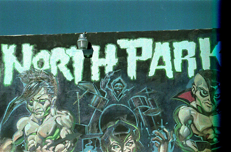
I developed this picture of a mural in the North Park neighborhood of San Diego using bleach bypass. Now I didn't get quite what I thought I would or even what I wanted. There was a base fog because the film was 10 years expired and of unknown storage history. So the negatives were very dense and my scanner (Epson V600) had trouble pushing enough light through them to get the image. So there is electronic noise on top of the add grain from the remaining silver. So what to do? I just took the strips and dunked them in the bleach (room temp for about 15 minutes). Curiously, I did not need to re-fix. The negatives were nice and 'clear', that is the base fog was gone and they looked like normally developed color negatives. One more note is that I used ECN2 chemistry on these. That system is meant for use with motion picture films, but this was just regular old color negative (CN) film designed for C-41 development. So technically, this is a cross process, though not a drastic one like developing slide film as negatives.

So here are the results, first the bleach bypass, then the same image after bleaching.. Let me know which you like better. I personally like the bleached image better, but I will definitely try this process with other film stocks. Since it is 'reversible', there is really nothing to lose.


Sunday, October 14, 2018

Worthy of Redundancy

Ultrafine Xtreme! It seems a little silly to brand something with "Ultra" and "Extreme" in the title. In Latin, the prefix 'ultra' means 'extremely' or 'beyond'. So they are trying to send a message here. They want us to know that this film is fine grained. Now if you've shot enough film, you know that these claims are largely created by the marketing department of the film company and don't always hold true in real life. Especially with black and white film, grain is affected by so many variables from EI (exposure index or apparent iso) to the plethora of developers, dilutions, temperatures, agitation schemes... The list goes on. So I'll be forgiven if I approach "Ultrafine Xtreme" film with a touch of skepticism. This is compounded by the very (not Xtremely) reasonable price, which in Western culture means lower quality. I bought 10 rolls of 120 Ultrafine Xtreme 100 for around $5 per roll. For comparison, Ilford Delta 100 and Kodak T-Max 100 are both over the $6 mark (what? no more Acros 100?? BOOOOO! to Fuji!!!). So let's see what my $1 per roll savings is going to cost me.

I loaded my roll up in my 'chrome-tastic' Bronica S2a (read more about that camera here) with the always pleasant and reliable Nikkor-O-C 50mm f/2.8 lens. This is the sharpest medium format option I have and a great camera to use, so why not? I shot the film at iso 100 because that's what the box says on it. Can I push it? Can I pull it? What are it's reciprocity characteristics? None of these questions mattered. I just wanted to shoot it straight and see what the baseline is. And that's what I did.

Before I get to the shots, I'll describe my development scheme briefly for the home developers out there that nerd out on this kind of stuff. I used two DIY developers mixed together. First was My-tol (Kodak X-tol look-alike). I mixed that up at 2:1. Then I added some Parodinal at 1:100. I developed the film for 11 minutes at around 70F using the usual agitation scheme (constant for the first minute and then 4 inversions every 30 seconds). Fixer was Ilford Rapid Fix 1:4. There, how's that for brief?

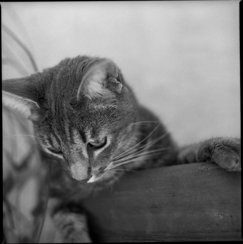
One of the tough subjects when it comes to fine grain and sharp lenses is animal fur. I scanned this shot at 1200 dpi and I think I am running out of pixels before I run into grain.
Scratchy McBiterton

Here is a 100% crop of that shot.

I have to say I was impressed. At least with this developurr combination (sorry), this film does indeed show very very fine grain. Is it "Ultrafine"? Well, we are dealing with sort of subjective, qualitative terminology here, so I'm going to say YES! It is Ultrafine! Put this film behind your sharpest lens, develop it with a high accutance developer, and be confident that you are going to get some Xtremely good results. "But James", you say. "Doesn't high accutance and sharpness mean that the low contrast areas are going to look grainy?" Let's see. Here is a 100% crop of the blank out of focus wall behind the subject.

The answer is "yes, there is some visible grain." Is it distracting? Is it "golf ball grain"? No. It is what I would characterize as "filmy" grain. It's the grain that lets you know that you are shooting film. I personally like grainy film (usually). The exception to that rule was Fuji Acros in Caffenol-CL. That was so smooth and creamy and lovely. I could just stare at the blurry backgrounds. But usually I like to have some grain in the image just as a creative device, sort of like the way I left the S2a film mask in this image as a border. It's a layer of abstraction that adds interest.

Now we come to the 'caveat emptor'. Here we see what saving $1 cost me. There were two shots on the roll of 12 that had artifacts. These looked like perfectly round clear spots on the film. I don't think that they were air bubbles that didn't get developed since that is not ever a problem with my agitation and there were only two of them on the whole roll. I think these are actually flaws in the emulsion. Take a look near the bottom of the gate. I'll keep an eye out for more of these in future rolls. I hope this is a Xtremely rare slip up by the QA department. If it is truly a "feature" of this film, I'll probably spend the extra $1 per roll and use T-max. But if not, if it turns out that Ultrafine Xtreme 100 is a good reliable fine grained film, then I will certainly buy more.

Friday, April 20, 2018

This Argus is Super

Thanks to Madmen, midcentury modern is the bee's knees. Generally people are looking for furniture and design elements for their homes. Me? I love 50's cameras. Give me bakelite over titanium any day. The classic "faux TLR" is the Brownie Hawkeye Flash. I have two of those and they are genuinely fun to shoot. Taking a (small) step up in control brings me to another favorite, the Argus Super Seventy-five.

These were made in the mid to late 50's in Ann Arbor, Michigan and man were they well-made! Of course they are pretty simple, but the overall quality of build is just very good. The apertures range from 8 to 16 and the leaf shutter hits in the 1/30th to 1/50th range. Fortunately, the heft of the camera (about 1.2 lb (530g)) and the neck strap make it pretty easy to hold steady. The lens is a simple 65mm "Coated Lumar" meniscus, so don't expect anything tessar-like, but for those of us who enjoy the nostalgic feel of the photos taken with a simple lens, this performs quite well. I have flipped the lens backward in mine, so I get a characteristic radical blur around a reasonably sharp center. Focusing is by range, lining up your subject distance (in ft.) with a pointer next to the lens. At f/8 or higher, you don't have to be extremely accurate with your estimation. It will focus down to 3.5 ft. There was originally a slip-on closeup lens, but I don't have that accessory and probably wouldn't use it if I did. Correcting for parallax with a camera like this is going to take practice and I have too many cameras in the rotation to remember the quirks of each one. In the picture here, you can see the red indicator in the taking lens that says that the shutter is cocked. The shutter button is pretty stiff on this camera, so the chances of accidentally tripping it are practically nil. The real highlight of this camera is the viewfinder. It is so big and so bright that composition is a true pleasure. It is a reflex, so the image is backward, but not upside down. Remembering to focus the lens is the only down-side of having such a nice viewfinder, but get the process locked into your brain before you go out and you shouldn't have a problem (focus, compose, focus, shoot, wind). Lastly, it is worth mentioning that this camera takes 620 film. So get on the google and either clip off the outer edges of your plastic 120 spool or rewind the film onto a 620 spool and you are good to go. New plastic 620 spools can be purchased from the Film Photography Project store, or buy some cheap expired 620 film from Etsy or Ebay and get some classic metal spools with it. However you go about it, these mid-century beauties are well worth the effort to get out and shoot.

These shots were taken on Ektachrome that expired in 1981 and were developed in my own DIY C-41 soup. First up are shots from a cloudy day at the beach.

argus75-ektachrome200-001 argus75-ektachrome200-002 argus75-ektachrome200-004

These next shots were from a sunny walk near the beach in La Jolla. I was surprised at the vast difference in color saturation with just a few more stops of light.

argus75-ektachrome200-007 argus75-ektachrome200-008 argus75-ektachrome200-010 argus75-ektachrome200-011

Friday, April 6, 2018

Reversal - The Finale

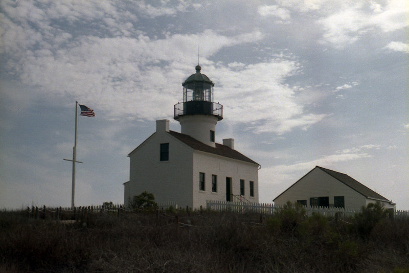
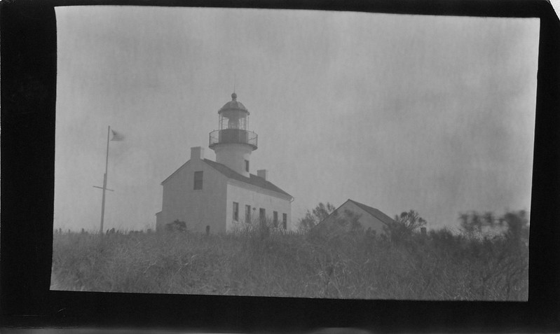
Well, it took a while to get this all together and done, but I finally finished the project that I initially had in mind when I bought the Ansco 3A 122 'Postcard format' camera. I wanted to shoot paper in the camera and reversal process it to positive images and send them to friends as postcards. And that is what I did. I made 20 individual exposures on 20 pieces of Arista Grade 2 paper. I had to take the photo, then take the camera off of the tripod and put it in a film changing bag where I had an envelope for exposed sheets and one for unexposed sheets. Then I would remove the back of the camera and take the exposed paper out and put a fresh piece of unexposed paper in. Repeat x20. That took about 2 1/2 hours, just to take the pictures. Fortunately, I chose a beautiful location, the Old Point Loma Lighthouse, so spending time there was a delight. It was mid-January so it was pleasantly cool with a little breeze from the ocean and sunshine just barely filtered by some thin high clouds.

Here is a shot of it on expired Fujicolor, taken in my Vitomatic II, just for reference.Point Loma

I have gone through the processing steps in previous posts and there is a long discussion over on Photrio about it, so I won't rehash it all here. I will just mention that the paper was graded at iso 2 which resulted in a 12 second exposure at f/64. So with no further ado, here is the result.

And here is a scan of the one of the postcards itself.

Old Point Loma Lighthouse

This was a super-fun project and I love sending these postcards off to friends and family. The Ansco 3A performed beautifully and was great fun to have out in the field. I highly recommend making postcards and sending them with hand-written notes to those you care about.

Monday, January 8, 2018

Reversal Revisited

If you remember this post about reversal processing images taken on photo paper (enlarging paper) in-camera, then this might be of some interest. I have done some more experimenting. At first, I made the terrible mistake of changing too many variables at once. I was trying different papers and rushing through the processing procedure and the results were all bad. In order to understand a process like this, you have to isolate a variable and just change that incrementally so that you can see what effect that variable has on the end product. So I decided to just use one paper (Arista Grade 2), one camera (Graflex Speed Graphic with the Graflex Optar 135mm lens), and one dev/reversal process (outlined in the aforementioned post). So I took 4 shots of a high-ish contrast subject. I only varied the exposure. I used iso ratings of 0.25, 0.5, 0.75 and 1.0. I know those seem like extremely low ratings, but it turns out they are in the right ballpark. I started here based on some vlogs by Joe Van Cleave as well as some initial Googling and experimentation. Anyway, I wanted to share my results, so here goes.

These are in order of low to high iso rating. The subject is a scooter and a padlock against a brown fence in direct sun. The exposures were all done at f/16 and the times were 4, 2, 1.5 and 1 second respectively.

I can tell very little difference between the last two, but they both look about right. They might tolerate a bit less exposure, but for a regular scene with more mid-tones, I think iso 1 will do nicely. So here's what I think I am learning about this process. Expose more than you think you should. Develop to completion on both dev steps. Stop and wash completely! Keep the bleach fresh (I make 300 mL and discard after 4 sheets). If you have bleached adequately, you don't need to restrain the second exposure. I am using bright bathroom lighting for 2 minutes.

Now the next step will be to make exposures in my Ansco 3A and get some postcard format pictures out that I can send to my analog photo friends. I might even try tank developing those and see what happens. If you are doing reversal processing, drop me a comment and let me know how it's going.